Key Takeaways
- Think minimal and well composed so your logo is memorable and can be used effectively on all branding materials. A tidy design means your logo can be identified wherever it is seen by your customers.
- Choose colors and fonts that best suit your particular brand personality to get the appropriate emotional feel across to your customers. Punctual use of these elements establishes trust and bolsters your professional brand.
- Personalize design templates by deconstructing layers and swapping elements. Don’t use stock layouts verbatim. Make your brand different from the competition!
- Always remember to test your logo at different sizes and avoid complicated details in order to maximize readability and scalability. A good logo will be crisp and legible, regardless of whether it’s on a tiny profile icon or an enormous printed banner.
- Respect some design rules and don’t use too many colors or fonts to keep it classy. By not using more than two or three colors and fonts, you avoid clutter and confusion.
- Confirm your license to any assets and download in various file formats. Keeping ownership and having quality export options like PNG or PDF means you are ready for both digital and print.
===
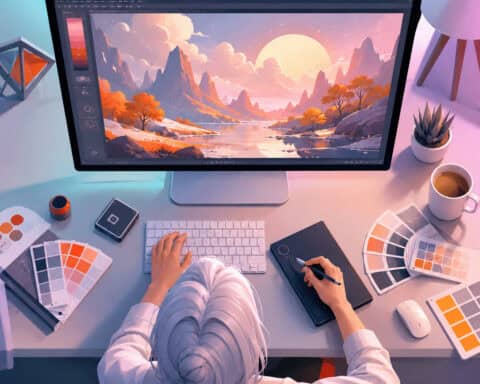
Create professional logos without the complexity of advanced software using Canva’s beginner-friendly drag-and-drop design tools. Users choose from thousands of pre-made templates to tailor icons, fonts, and colors to their specific needs.
You get complete control of layout tweaks and exports in file formats such as PNG or SVG. These features enable you to establish a consistent identity fast.
The subsequent portions discuss how to traverse the platform and polish your designs.
Understanding logo design fundamentals
![]()
A logo serves as an exclusive identifier that encapsulates your brand’s spirit and industry standing. Successful designs prioritize simplicity, as a logo needs to be memorable across many different media. Balance gives it a sturdy visual skeleton, and contrast can make it pop. Minimalism, like your initials, works best.
Color psychology
Colors evoke emotions. Blue tends to communicate trust and red communicates energy. Tech brands tend to be in cool tones while restaurants skew warm.
Use hex codes in Canva to maintain color uniformity. Limit yourself to four colors or less to keep things clean. Analogous palettes are good for harmony.
Font personality
Fonts are a narrative before a customer even reads the copy. Serif fonts seem traditional and professional, whereas sans-serif styles are modern and clean. Script fonts provide a personal note.
Montserrat is a wonderful option for a neutral, clean appearance. League Gothic adds a bold, punchy presence. Select a typeface that echoes your brand’s tone.
Shape meaning
Geometric forms create order. Squares and rectangles convey strength. Circles and rounded edges come off as soft and approachable.
Icons give dimension to wordmarks. Make sure your selected shapes fit in with the professional world. A well-placed shape of a logo design anchors the entire design.
Brand identity
Your logo is the basis for your brand. It has to appear wonderful on social posts and web headers. Consistency establishes trust.
Leverage your logo for authority. Make it simple so people see it and understand it. It serves as the identity of your company.
Your canva logo design process
Designing a logo is both art and strategy, and it’s where your visual identity begins to take shape. Wake up your workspace and open a new project tab, turning concepts into pro-level files.
1. Define your brand
Define your brand first, then open the editor! Choose a name that speaks to your readers.
Choose whether you want a minimal style or bold text. Mention if you’re a tech company or clothing brand. Your logo reflects your brand personality.
2. Find inspiration
Browse our library of templates to get ideas. Search for Sans Serif or Serif fonts that fit the industry trends.
Gather some layout inspiration. Check out competitors and see how they use imagery well. This way you know what works for your market.
3. Choose a template
Choose from millions of templates that match your project. Filter for a clean and simple starting point.
Seek out flexible designs. Choose a template that allows you to quickly modify text, icons, and background colors for that personalized touch.
4. Customize elements
Exchange placeholder text with your business name from the font menu. Include icons or shapes to make it more interesting.
Resize all elements to give it a polished look! Utilize the edit tools to modify colors, sticking to four or less to avoid being visually overwhelming.
This next stage is all about turning your rough sketch into a finished product.
5. Finalize and export
Export your design as a PNG for premium quality usage. Click on transparent background if you want to place your logo over photos.
Download in various sizes for profile pics or banners. Make sure your logo is scalable and recognizable on all platforms.
Compare the final outcome to your initial objectives to confirm it makes the appropriate impact. Colors are emotional triggers, so ensure your final palette matches your brand.
Making templates uniquely yours
Starting from a template saves time, copying it exactly makes your brand look cookie-cutter. If you want to be different, you have to take the design apart and reconstruct it into your particular self. Focus on a single nugget of thought.
Deconstruct it
Choose the template and press the ungroup button in the editor. This allows you to shift fonts, icons, and backgrounds as distinct elements. You can then remove any extra lines or flourishes that do not suit your message.
Shuffle things around a bit so that your business name is at the center of the visual hierarchy. By cutting clutter, you keep the design clean. This transforms a cookie cutter design into a personalized resource.
Swap colors
Begin your design in black and white to concentrate purely on the layout. When the layout is right, it’s time to add your official hex codes. Stylize it professionally with a palette of 4 colors or less.
Good contrast between your background and graphics really makes the logo ‘pop’! Mix and match templates to discover which combination crafts the most compelling look for your brand. Using the same colors everywhere creates recognition.
Change fonts
It’s your typography that really defines your style! Find just the right typefaces for your brand personality. Perhaps a heavy serif for impact or a minimalist sans-serif.
Source: About Making templates your own. Try a blend of two hot to strike a nice balance. Then scale the text in such a way that it remains easy to read on small screens and large print-outs.
Add elements
Search the graphics library for icons that fit your industry. There’s nothing better than adding a unique shape or line to give your work a signature flair.
Be sure to keep these additions either centered or towards the sides to keep proportions perfect. Use stickers only when they provide an obvious benefit.
Way too many add-ons will make your logo look cluttered. By selecting pieces that express your uniqueness, you craft a look that feels truly your own.
Avoiding common design pitfalls

Professional branding works when design is clean and utilitarian. Novices tend to have problems with balance and noise, which can dilute a brand’s effectiveness. Prioritizing simplicity keeps your logo memorable and flexible across all digital and physical platforms.
Overly complex
Dumb it down, way down, by eliminating design elements that get lost on little business cards or the like. Try to identify one or two things that truly encapsulate what you’re about. Use obvious visual hierarchies to lead the viewer’s eye to the essential elements of your design.
Don’t use too many filters or effects because these detract from your message. Default to using squares or triangles to start with.
Poor fonts
Be consistent – use one or two fonts at most. Don’t combine mismatched styles. This causes a hectic feel that disorients the audience. Not to mention avoiding Comic Sans unless you want a parody effect.
Keep your typography legible at all sizes. Never mix left and center aligned text in one file.
Clashing colors
Choosing a palette to avoid eye strain. Use these tips to build a professional look:
- Keep your main palette to two to three colors for a lean, sophisticated look.
- Use analogous or complementary schemes to create natural contrast.
- Avoid high-intensity colors that fight for attention.
- If you feel you are in trouble, refer to basic color theory models.
Juxtaposing opposing colors makes key elements pop. Nothing like a slight drop shadow on copy for depth. Use only one effect, not ten. Clean it up!
Ignoring scalability
Your logo needs to be crisp, whether it’s on a big billboard or a small social media icon. As a rule of thumb, always test your design by shrinking it down to see if the text doesn’t blur or vanish.
Steer clear of thin lines that could vanish in printing. Employ vector-like clearness to maintain sharp, professional edges. If you use a monogram or combination mark, don’t let the letters bleed into one another.
A well-balanced logo doesn’t shift weight to one side, which makes the visual experience stay even for all viewers. Make sure your final file type is capable of the resolution you require for print as well as for digital.
Selecting the best canva font

About: Choosing the best Canva font You have to strike a compromise between fashion and function to make your message connect with your readers. Use Canva’s filter tool to narrow down by categories like “Serif” or “Display.” Always double check the font supports your business name’s specific characters.
Establish an obvious hierarchy, for example, by using bold weights for main titles and lighter styles for taglines.
Readability first
Choose fonts with easily distinguishable letter shapes that don’t blur together at a glance. Try them out on small mobile screens and large desktop displays, as scale affects legibility. Steer clear of intricate calligraphy that muddles readers.
Keep enough white space between letters so that characters don’t run together. Take Montserrat for a sleek, contemporary, and geometric finish that remains legible all around.
Brand alignment
Match your font personality to your industry. Serif fonts such as Libre Baskerville convey trust and professionalism, so they’re great for law firms or finance. Handwritten scripts provide a warm, personal feel for artsy boutiques.
Font Style | Ideal Industry |
|---|---|
Serif | Luxury, Legal, Finance |
Sans Serif | Tech, Startups, Modern Retail |
Script | Events, Personal Brands, Cafes |
Display | Entertainment, Creative Studios |
Use elegant serifs for luxury products to convey quality. If you want to be perceived as a bold leader, go for unique display fonts. Think about the core message prior to making your choice.
Font pairing
Pair a strong display typeface with a more simple neutral font. This contrast adds depth and visual interest. Don’t combine two like styles, such as two different handwriting fonts, as this looks cluttered.
Keep it professional and limit yourself to two font styles total. Now stick to the same font family. Canva includes a ton of curated pairs that are already tested for success.
I still like the combo of a bold header with a delicate body font. Go with your gut on what fits your audience.
Protecting your new logo
Defending your new logo. You have to make sure your logo stays unique and legally secure as you develop the brand for many years to come.
Understand licensing
If you’re building a brand, verifying Canva’s license terms is an important initial step. You need to be aware if your fonts and graphics are fully commercially usable. Not all icons or fonts are free for commercial use, so check the site terms closely.
Usually, default assets are okay for non-commercial projects, but premium plans provide more protection for business endeavors. Make sure that you’re legally entitled to your logo as a company mark. Document your licenses to prevent hassle later on.
Add a watermark
- Reduce the logo’s opacity to approximately 20 percent with the transparency slider.
- Put this quiet mark somewhere in a bottom corner of your pictures.
- Include a copyright symbol to clearly signal your ownership.
- Export these versions just for social media posts or previews.
This additional layer of discouragement prevents someone from swiping your work. It stays on your brand even if someone reposts your image without attribution.
Save file types
Save it as a PNG when you want a transparent background for your site. This way, your logo remains crisp and accommodates any colored background.
Save a PDF version for business cards or big signs. You will need high-resolution print files too for a professional look.
Keep your original project file inside the app for fast edits down the road. You may need to swap colors or modify the layout as your brand develops.
Export a white version of your logo to apply to dark backgrounds. A clean, symmetrical logo is optimal in all of these cases.
Use four colors or less to maintain a clean, timeless look. Test your logo in black and white to make sure it is clear for all uses!
Conclusion
Carefully design your logo to create a strong brand. You begin with basic shapes and crisp fonts in Canva. You maintain your appearance neat to assist folks locate your company quickly. You try out your file sizes to keep them sharp on screen or print. You back up your work in secure locations. Well-designed logos tell your story and convey your mission with no unnecessary clutter. You earn credibility with a consistent, clean design. You’ve got what it takes to make a professional impression. Go ahead, spend some time playing with your layout now. Open up your Canva dashboard to start your initial sketch.
Frequently Asked Questions
Is Canva a good tool for beginners to design a logo?
Yes, Canva is super for beginners! With its drag-and-drop interface and immense pre-made template library, it simplifies professional design work without any graphic design background or costly software.
Can I copyright a logo I design in Canva?
Sure, you can trademark a logo you make, but you can’t really copyright a logo you made from Canva’s stock elements. You own it all if you use unique elements or heavily customize templates so your final design is unique and far removed from the stock assets.
How do I make my logo look professional in Canva?
Here’s the key for beginners in logo design with Canva: keep it simple! Incorporate high-quality icons, stick to a 2-3 color palette, and use readable fonts. Adequate spacing, or white space, is necessary to make sure your logo appears neat and balanced at any scale.
Should I use a template for my business logo?
Templates are wonderful jumping off points. You should make them your own. Customize the colors, fonts, and layout to fit your brand. By implementing these modifications, you guarantee that your logo is still original and doesn’t resemble other businesses using the same template.
What is the best file format for a logo?
For logos, export as a PNG or SVG. A transparent background PNG is best for the web. An SVG is a vector file, meaning you can resize your logo to any size without losing quality or becoming pixelated.
How many fonts should I use in a logo?
Make it simple. Use a maximum of two fonts. Using a font for the brand and a different font for a tagline creates visual interest without appearing cluttered. Make sure fonts are legible, even when the logo is small.
Related: Invitation Maker Canva: The Complete Guide to Designing Stunning Invitations
Related: How to Create a Canva Birthday Invitation That Actually Looks Professional
Related: Canva for T-Shirt Designs: The Complete Guide to Creating Print-Ready Graphics
Related: Canva AI Code: A Complete Guide to Canva's Code Generation Feature
Related: Canva AI Image Generator: The Complete Guide for 2026
Related: Canva QR Code Generator: How to Create and Customize QR Codes in 2026
Related: How to Choose and Use the Best Canva Resume Template in 2026
Related: Canva AI Video Generator: A Complete Guide for 2026
Related: How to Create Business Cards in Canva: The Complete Guide for 2026
Related: Canva Barcode Generator: The Complete Guide for 2026
Related: Canva Video Editor: The Complete Guide to Features, Limits, and Smart Workarounds
Related: Canva Pro: The Complete Guide to Features, Pricing, and Whether It's Worth It in 2026
Related: Canva Logotipo: The Complete Guide to Designing Your Logo in Canva
Related: Canva AI Headshot Generator: A Complete Guide for 2026
Related: Canva Sticker Maker: The Complete Guide to Designing and Printing Custom Stickers
Related: Canva Shirt Design: The Complete Guide to Creating Custom T-Shirts in 2026
Related: The Complete Guide to the Canva App in 2026
Related: Canva Free: The Complete Guide to What You Get Without Paying a Cent
Related: Canva Draw: The Complete Guide to Freehand Drawing in Canva
Related: Canva Download: The Complete Guide to Exporting Your Designs in 2026
Related: How to Use Canva: A Complete Guide for Beginners and Beyond
Related: Canva Marketplace: The Complete Guide to Buying and Selling Design Templates in 2026
Related: Canva Whiteboard: The Complete Guide to Visual Collaboration in 2026
Related: Canva for Students: The Complete Guide to Free Design Tools in 2026
Related: Canva Ideas: A Complete Guide to Creative Projects and Better Designs in 2026
Related: Canva Book Cover Design: The Complete Guide to Creating Covers That Sell
Related: Canvas Drawing App: The Complete Guide for Every Skill Level in 2026
Related: Canva CV Maker: The Complete Guide to Building a Standout Resume in 2026
Related: How to Build a Canva Portfolio That Actually Gets You Hired
Related: Canva Brand Kit: The Complete Guide to Building Consistent Brand Identity in 2026
Related: How to Create a Canva Brochure: The Complete Guide for 2026
Related: Canva Reviews: An Honest, In-Depth Look at the World's Most Popular Design Tool
Related: Canva Learning: The Complete Guide to Mastering Design Without a Degree
Related: Canva US: The Complete Guide to Using Canva for Design in 2026
Related: How to Become a Canva Contributor and Earn Passive Income in 2026
Related: How to Use Canva AI Poster Design to Create Stunning Visuals in 2026
Related: Canva AI Chat: The Complete Guide to Designing With AI in 2026
Related: How to Create and Use a Canva Signature for Documents, Emails, and More
Related: How to Create a Canva Flow Chart: The Complete Guide for 2026