Key Takeaways
- Know your email’s mission and audience before you start designing so that your template suits your business needs.
- Build a wireframe, apply brand identity elements consistently, and optimize images for fast loading with Canva email template creation.
- Stick to fundamental design principles such as visual hierarchy, smart use of color, and white space to keep your content scannable and readable.
- First, keep mobile and accessibility in mind. Use high-contrast text, alt descriptions for images, and nice, big call to action buttons.
- Pop your exported Canva assets into an email marketing platform, double-check the links and test across devices.
- Iterate your approach by A/B testing design variations and using engagement metrics to inform future campaign design.
===
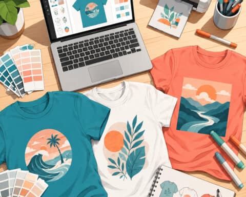
Canva email template creation utilizes the platform’s drag-and-drop editor to craft personalized layouts for your digital correspondences. You construct professional graphics from pre-designed elements, tweak color schemes, and organize text blocks to align with your brand.
These files export as high-quality images or HTML for your email provider. Knowing these design steps keeps you visually branded consistently in all your customer touch points while streamlining your daily workflows.
Plan your email template strategy
In other words, a good email strategy ties your design decisions to quantifiable business objectives.
Map out your goals before launching Canva so each email fills a purpose in your broader digital marketing strategy.
Define purpose
Determine
How to create email templates in Canva
Canva is a powerful tool for email marketing, allowing users to design appealing emails with its drag-and-drop interface, making it easy to create effective email templates that enhance engagement.
1. Project setup
To begin, click ‘Create a design’ and select ‘Email Header’ or enter a ‘Custom size’. Make sure your width is less than 600 px so that everything loads fast for your readers.
Utilize rulers and guides to maintain a clean layout. Drag your brand logos into the editor with the upload button to keep your look distinctive.
2. Brand identity
- Use your color palette on every shape and background.
- Top your logo off at the top so people know it is you.
- Select fonts that remain legible on any phone or computer.
- Save these assets in a sidebar for rapid and convenient access.
Consistently breeds trust, especially when appealing emails use coordinated colors with your website, making users feel at home.
3. Core components
Achieving a balance of about 60% text to 40% images is crucial for effective email marketing. This ratio ensures your message remains uncluttered and appealing. Utilize an email template to pull text blocks into the frame, and consider incorporating interesting images or visuals that enhance your email design.
To attract clicks, insert buttons that pop against the background and add your email signature at the bottom for a personal touch. Ensure that the layout of these components allows the reader’s eye to flow seamlessly down the page, enhancing the overall user experience.
4. Image creation
Utilize the integrated tools to design banners or product shots. If you’ve got stuff to flaunt, put multiple images inside Canva.
Never forget to add alt text to your images so that everyone can access your content. Keep files small. If your images are too heavy, they could bog down the email or get caught in spam filters.
Top quality is nice, but fast is better.
5. Final export
Keep your pieces as PNG or JPG files. Dump them all in a folder so they’re ready to go! Pasting directly into apps like Gmail can be touchy, so you’ll likely want to employ a tool to transfer your design over properly.
Simplified design and no massive files mean your message arrives perfectly every time!
Design principles for impact
Good email design is a vital component of effective email marketing, focusing on purpose and aesthetic coherence. By adhering to these core principles, you can create appealing emails that guide readers through your message and look professional on every device, enhancing deliverability across various email clients.
Visual hierarchy
Your hottest headers belong at the top for instant impact. Make titles larger and bolder than the body font.
Place your main call-to-action button where it ends a thought. With your layout, don’t wear your design principles too proudly. Keep it simple with a single-column structure to lead the reader toward the CTA.
This keeps your eye on the prize.
Color psychology
Pick colors that complement the message. High-contrast buttons make your CTA stand out against the background.
Cap your colors to keep it looking neat. Test your colors against typical backgrounds to ensure they come through.
One bold color for buttons tends to drive clicks.
Font pairing
Limit it to two fonts to keep it clean. Combine a bold, decorative font for headings with a simple, legible font for the body.
Be sure your fonts render on all major email clients. Apply ample line spacing to keep the text readable on cell phones.
Tight, cramped type is usually less engaging.
White space
Employ padding to images and copy to rest the reader’s eye. This keeps your layout from appearing cluttered or overbearing.
Add margins to frame your words so they don’t sit right up against the edge of the screen. This gives a clean, sophisticated appearance.
Some clear white space separates the different parts. It leads the reader through your copy organically.
Last, make your design feel open and welcoming. Never overfill one small space.
Avoid common design pitfalls
Design mistakes can mean bad engagement or emails hitting spam folders.
About: Steer clear of design disasters.
Image overload
A large number of images can set off spam filters and delay load times for your readers. As a general guideline, balance text and visuals so your message remains clear even if a client’s email provider blocks your images.
Don’t ever use a purely image-based layout, as it baffles screenreaders. Be sure to include alt text on all images so your content remains accessible.
Poor accessibility
High contrast between text and background is important. Don’t use light gray type on white backgrounds; it’s hard to scan! Avoid common design mistakes.
Use headers and sub-headers to help assistive technology navigate your layout. Providing alt text for each image guarantees that visually impaired users get your point.
Mobile neglect
A lot of people check mail on phones, so mobile-first. One column layouts are ideal for small screens. Don’t let your buttons be too tiny to tap with a thumb.
Try your template out on an actual phone and check to see if it looks right. Never take for granted that a design that works on a wide desktop screen will work on mobile.
Vague call-to-action
Make your call-to-action visible and obvious. Don’t use buttons such as ‘click here’ or ‘find out more’; instead, use ‘Shop Now’.
Put these buttons high enough so users see them without scrolling. A button needs to pop from the rest of your design to aid click-through.
Nothing in a design should be there ‘just because’. Spare components just mess up your design.
Restrict your palette to two or three primary colors and one accent to maintain your professionalism. A combination of two or three fonts for headlines, body, and emphasis is stimulating.
Keep in mind that white space is content’s breathing room. A messy composition feels like you didn’t care, so keep it clean!
Never hit send without proofreading! You need high-resolution images as low-quality files appear amateur. At the very least, use font sizes to establish a visual hierarchy.
Integrate your canva template

Exporting your Canva design into your email marketing software requires some effort. You need to export your assets, fit them to native layout tools, and map text blocks for a clean translation, ensuring effective email marketing with appealing emails and interesting images.
Choose platform
Choose an email tool that supports custom HTML or direct image import nicely. Options such as Benchmark Email offer editors that make this work easy. Check that the platform takes the file types you exported.
Search for native tracking capabilities so you can view email performance.
Upload images
Upload your design to the platform’s library. Give them obvious names such as “newsletter_header_v1” for easy searching. Use images less than 600 pixels wide and compress files for fast loading.
Place these in your template slots. Don’t forget the descriptive alt text for accessibility!
Add links
Click on your text or buttons that you want to be clickable. Add the target URLs through the link manager in your editor. Double check every destination to avoid broken links.
You can even add tracking tags to your links to find out which ones your readers click on most.
Test display
Test it yourself and your team. Preview it on mobile and desktop apps such as Gmail and Outlook. Get about 60 percent text and 40 percent images and you will be out of spam folders.
Correct any alignment mistakes prior to dispatching your concluding email to your entire list. Make sure all the buttons function as they should.
Optimize for engagement

Great email design is a vital component of effective email marketing, striking a balance between images and copy to lead the reader. Utilizing obvious headers while maintaining approximately 60% text in the entire email template assists with deliverability and creates appealing emails.
A/B test elements
A/B test two versions of your design. Don’t change six things, just one, like the headline or the image, so you know what makes the results change. Send these to small groups initially.
Element | Version A | Version B |
|---|---|---|
Headline | Direct | Benefit-driven |
Image | Product focus | Lifestyle shot |
Seeing these outcomes propels you toward your dreams. Choose the winner to forward to your entire list.
Personalize content
Personalization makes your emails feel timely. Use these steps to improve your connection with readers:
Use merge tags to add the reader’s name.
Group your audience by their past interests.
Show products that match what they bought before.
It’s a strategy that allows you to send the right message to the right person. Customized content gets more clicks than mass emails.
Analyze metrics
Checking your data reveals what works. Monitor open rates, click-through rates, and bounce rates to find out how your audience responds to your style.
Pay attention to when your readers open their mail. If they read more on Tuesday mornings, schedule your next send for Tuesday morning. See what banners or buttons were clicked the most. Did ‘Shop Now’ outperform ‘Learn More’?
Metric | Goal | Value |
|---|---|---|
Open Rate | 25% | High |
Click Rate | 3% | Good |
Bounce Rate | <1% | Stable |
Take this information to switch up your next campaign. If a layout clicks, keep using that structure in your Canva templates.
Think of this as an iterative loop where you construct, prototype, and then improve your next model. Mobile users first, always, because they are such a massive portion of your target audience.
Make buttons easy to tap and images load fast on phones. This continual honing allows you to increase your impact over time.
Conclusion
Craft quality emails to establish powerful bonds with your audience. You achieve obvious results with clean designs. Canva makes it easy to create sleek designs that adapt to any screen. Play with your colors and fonts to find what best suits your brand. Keep your text snappy to aid fast reading. Utilize eye-catching links to direct your clicks. Little adjustments make huge reach differences. You save time when you recycle your best stuff. Ready to craft your first draft in Canva? Choose your preferred design and spread your message far and wide. Head over to the Canva dashboard to create your own personalized email template now.
See also: Canva Design School.
Frequently Asked Questions
Can I use Canva to design professional email templates?
Yes. Canva email templates serve as a powerful tool for email marketing, allowing you to customize visual components, incorporate your branding, and export your appealing emails to your favorite platform.
How do I export a Canva design for email use?
Once your email design is complete, click ‘Share’ and choose ‘Download.’ Either select PNG or JPG to save your image email. Then upload these files right into your email marketing software’s drag and drop editor!
Are Canva email templates responsive on mobile devices?
Canva is primarily a graphic design tool for static images. To ensure effective email marketing, keep your text brief and images crisp, especially for mobile email design. Testing your email template on multiple screen sizes is vital for readability across all inboxes!
Should I use a single image or multiple sections for my email?
Slicing your email design into multiple images allows for faster loading times and enhances deliverability. This approach enables you to insert clickable links in targeted areas, increasing your click-through rate.
How can I make my email template more accessible?
To enhance your email marketing efforts, ensure you’re always adding alt text for your images, as this is a vital component for accessibility. Employ high-contrast colors for your text and backgrounds to create appealing emails that all readers can interact with, regardless of their vision.
Can I add clickable links to my Canva email template?
Canva doesn’t allow hyperlinks directly in the exported images, which is a vital component of effective email marketing. After you click upload, you must insert your links within your email marketing software, using the platform’s editor to place buttons or links on top of your email design.
Related: How to Choose and Use the Best Canva Resume Template in 2026
Related: Canva AI Video Generator: A Complete Guide for 2026
Related: How to Create Business Cards in Canva: The Complete Guide for 2026