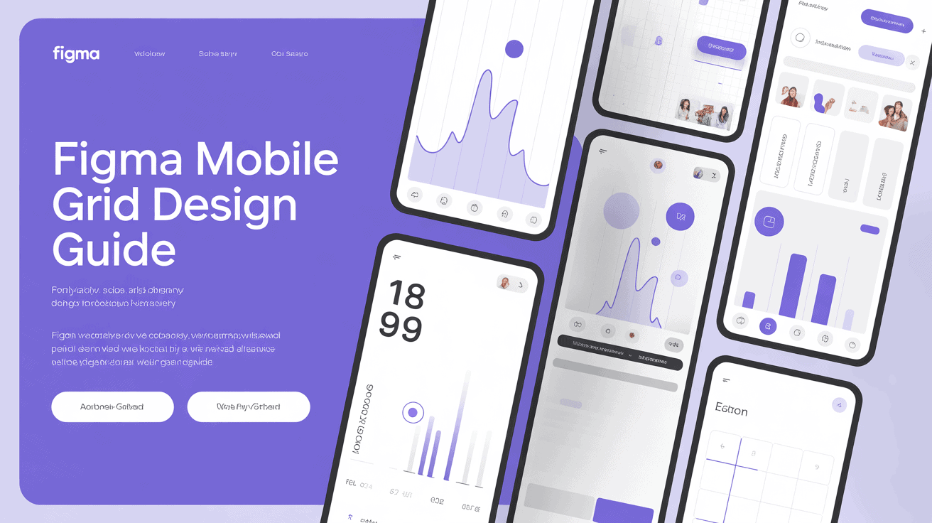
Key Takeaways
- Setting up a consistent grid in Figma enhances UI readability and keeps your mobile designs looking clean and professional across different sized devices.
- Use layout grid settings in the right-hand panel to specify columns, rows, or uniform grids that provide visual guidance to your components.
- Use an 8-point system for layout decisions to make spacing easier, keep vertical rhythm, and reduce friction between designers and developers.
- Export your configured grid settings as reusable styles to preserve consistency across multiple frames and streamline design for your team.
- Mix static layout grids with Figma’s Auto Layout to build responsive components that flow with varying screen sizes.
- Select your column count according to content density. Use a 4-column grid for typical mobile screens and 6 or 8 columns for intricate displays.
===
Figma mobile grid design applies a flexible column system to align app elements on small screens. You established these grids with consistent margins and gutters to maintain your design crisp.
A 4 pixel or 8 pixel base unit keeps you consistent across different device sizes. These organized layouts enhance user navigation and ease development handoff.
Keep reading to find out how you can use these grid settings for your next mobile project today!
Why your figma mobile grid matters
A consistent layout guide style is the foundation for any mobile interface. It forces you to make explicit decisions regarding spacing, alignment, and readability. When you construct a robust framework, you guarantee that your design remains coherent on each and every screen.
Most designers opt for a 4-column layout since that syncs up with both Android and iOS. This selection makes it simple to work with full or half-width blocks and keep your text eminently readable. Regular patterns enhance user experience with the help of layout guides.
Using grids as visual aids, you keep components such as buttons and cards in the same position on every page. This generates a consistent cadence that makes your app appear polished. You can nest grids in Figma to address complicated layout requirements, ensuring your design adheres to the ideal layout guide.
If you require more precision, a baseline grid that is derived from your font size can assist in aligning text precisely. This additional detail lends your UI a clean, balanced look. Crucial alignment comes when you pass your work off to developers, who appreciate the structured approach provided by a solid grid system.
a grid is a common language of units and spacing that eliminates guesswork. When every element snaps to a specific column or row, the handoff process is smoother. This sets you up for a time and error-efficient build phase, crucial for handling various types of devices.
Developers like obvious logic because it makes their code easier to write and maintain across devices. A professional design system should scale beautifully. Mobile devices come in many sizes, so your grid has to be flexible, accommodating complex designs with ease.
When you use a grid system, you have a unit of measure for all your padding and margins. In other words, your design looks equally good on a tiny phone as it does on a large screen. It provides your work with a feeling of structure and assists you in connecting various elements of the layout to each other.
Knowing grid logic is now a fundamental skill for any designer. It transforms chaotic designs into clean, adaptive journeys that readers love to embrace. By establishing these guidelines up front, you create a base that encourages future scalability and modifications.
You spend less time adjusting random pixels and more time addressing authentic user issues. A good grid stabilizes your design system, makes it scalable, and is device-agnostic.
Understanding figma layout grids

Figma layout grids are the skeleton of your mobile designs. You find these options in the right panel of any selected frame. You can toggle visibility with the eye icon to clear your view when you want to.
You want to use grid styles globally so that everything throughout your project stays consistent. The layout guide settings icon allows you to adjust the color, opacity, and z-index of your grids to maximize visibility. Remember, these guides are only for frames and they do not behave the same way as CSS Grid.
Columns
Change the layout guide type to ‘Columns’ to split your screen into vertical panels. Set a specific number to align with your mobile breakpoints, typically four columns for small screens.
Tweak the width and gutters until your text blocks span the container organically. Utilize the blue lines as a guide to keep your UI elements organized. You can nest these grids inside others for complex layouts.
Remember that auto-layout columns do not automatically resize to fit their content.
Rows
Change the type to “Rows” to control your vertical spacing. This aids you in maintaining component cards of equal heights across your app. Set your row height and gutter to create a distinct rhythm.
Snap your buttons and text to these rows to keep everything looking balanced. You can use these as a baseline grid for consistent typography. This setup is perfect for long-scrolling pages where vertical alignment is the name of the game.
Uniform
Choose the type “Grid” to have a square-based layout. This is ideal for aligning small icons or table cells with pixel-perfect exactitude. Most designers set these squares to 8-point increments to support an 8-point scalable spacing system.
You can select a hard grid, where objects snap to the fixed lines. Otherwise, use a soft grid to make distances between objects divisible by 8.
Try to keep your grid visible while you work in order to identify overlaps or spacing errors sooner. If you require more control, mix row and column auto-layout for intricate structures.
These tools cannot match CSS, but they are still necessary to achieve mobile precision.
How to create your mobile grid
A grid gives structure to mobile interfaces, allowing for alignment and spacing that remains consistent across screen sizes. By defining specific layout guides early, you create a crisp unit of measure for your design elements.
1. Add a layout
Choose your frame and locate the layout grid on the right sidebar. Add a new layer by clicking the “+” icon. There are grid, column, and row types to select from. For typical mobile work, column grids are the norm.
Once created, you should immediately tweak these settings to fit your project requirements. This keeps your design system consistent from the outset.
2. Set the columns
Enter your column count, usually 4 for mobiles. Set the type to Stretch so the columns automatically fill the frame width as the screen size shifts.
Drag the column lines to contain your content in the safe zones. Use preview mode to view how these widths work together with your container. This step helps you line up type and images.
3. Define the margins
Use margin values to introduce safe areas at the screen edges. These margins keep your content readable and thumb friendly.
Just be sure to consistently offset these margins with your body copy regions to maintain the visual hierarchy. Apply typical spacing values from your design system to maintain consistency.
Keep in mind you can even create a one-column grid by setting the gutter to zero and playing with the margin to taste.
4. Adjust the gutters
Gutter width defines the space between your columns. Regular gutters keep things from smashing up against one another.
Use a value that is modular to your 8-point system, if you can. Most designers rely on a 4-point baseline grid for type. This makes sure that all the text sits nicely on the baseline.
5. Save the style
Click the four-dot “Style” icon in the layout grid panel to save your configuration. Choose the “+” symbol to make a new layout grid style.
Name it something obvious like ‘Mobile Grid – 4 Column’ so your team can locate it quickly. When you share these styles from a library, it keeps everyone consistent.
This exercise echoes the modular ideas from the work of Josef Müller-Brockmann.
The 8-point system philosophy

By employing values such as 8, 16, 24, 32, 40, and 48, you’ve established a dependable skeleton for mobile layouts. Since the majority of screen dimensions are divisible by eight, this approach guarantees that your designs display nicely on multiple devices with no additional work.
It provides enough diversity to steer clear of boredom yet keeps your decisions under control.
- Streamline communication by giving developers a shared language.
- Restrict spacing options to clear increments to hasten decisions.
- Make sure all interface elements, from text to buttons, adhere to these values.
Vertical rhythm
Set your line heights and padding in the 8-point grid to keep the flow steady. Snap all text blocks and headings to this grid so the visual rhythm remains consistent.
When you snap inputs and buttons to these standard increments, you get great balance. Mind section gaps to maintain predictable, clean UX.
Some designers opt for 4-pixel line-height increments when they need tighter control. Eight is a great starting point.
Component consistency
- Set minimum and maximum sizes for each component with your grid styles.
- Keep components attached to styles so that they stay intact across the design.
- Ensure cards and button groups all have a grid boundary.
- Scale your icons to 8, 24 by 24 or 32 by 32 to fit the layout.
For a polished look, consistency is king; however, if a piece appears better outside the layout guides, feel free to break the rule, but do so sparingly.
Scalable spacing
Use relative spacing units that expand or contract with your point system. That way, it’s easy to send specs to developers who use 8-pixel logic.
Don’t select arbitrary pixel values. These shatter your mobile design hierarchy.
Designing tokens on this system enables fast layout scaling. When you specify your spacing in tokens, you guarantee that all elements of the UI stay in scale. This takes the guesswork out of design.
Beyond static grids with auto layout
Static grids offer a skeletal framework for mobile design. They tend to limit the movement of content at various screen sizes. When you pair these grids with Figma’s Auto Layout, you generate components that respond to change. Layout guides set a visual cadence, boost readability, and assist you in logically structuring components.
The grid auto-layout feature provides a subset of CSS Grid’s abilities and introduces two-dimensional control to your workflow, allowing you to manage rows as well as columns. This new layout guide style controls gaps and padding, so you don’t have to shuffle things around manually. You can set frames to ‘hug contents,’ which makes the frame size as small as possible while still obeying your spacing rules.
Type ‘Auto’ or ‘A’ for a track, and Figma assigns it to fill the container at one fractional unit. Elements can span multiple columns or rows, as long as only one item takes up one cell. While you can’t use CSS Grid’s named grid areas or subgrid, you can define track values using pixels or fractional units such as minmax(0, 1fr).
Nesting Auto Layout frames allows you to design sophisticated, responsive regions that remain beautifully aligned in your grid. These nested structures act predictably when you resize the parent container. If you want something to break out of the normal flow, either absolutely position it or mark the child object as ignoring the Auto Layout rules.
This toggle between normal flow and absolute positioning is a lifesaver when you encounter tricky edge cases a rigid grid cannot accommodate. Since the grid auto-layout tool operates only on certain track values, it serves as a solid baseline for capturing your design intent. You just place elements into cells and let the fractional units take care of scaling across different mobile devices.
This keeps your layout sane and allows you to break out individual pieces as needed. By mixing and matching these utilities, you transform a frozen grid into a dynamic, flexible matrix that accommodates various content forms. This makes the hand-off easy since developers can simply convert your track values into code.
Designers have more control over how components respond to screen width to deliver a clean, organized appearance on any device.
Best layout grid for mobile figma
Grid systems serve as an ideal layout guide for uniform spacing, alignment, and adaptability across different platforms. By utilizing these layout guides, you can maintain precision even across multiple screen sizes.
The 4-column standard
Attribute | Setting |
|---|---|
Columns | 4 |
Margin | 16px – 20px |
Gutter | 16px |
Type | Stretch |
This layout becomes the default for most mobile screens. It uses 16px margins so nothing touches the edges of the screen and 16px gutters for that extra breathing room.
I like how it’s all in line with Android and iOS standards so you can trust it for lists and cards.
- Check for stretch behavior to adapt to different devices.
- Keep the grid invisible to the user.
- Audit alignment frequently to catch errors.
The flexible 6-column
Attribute | Setting |
|---|---|
Columns | 6 |
Margin | 12px – 16px |
Gutter | 8px – 12px |
Designers employ this layout for thumbnail galleries or information card dumps. The increased column count allows for more flexible layouts in horizontal spaces.
As you add columns, you have to shrink your gutters for control. This is ideal for tablets or big phones where you need some extra space to squeeze more data in without losing structure.
The dense 8-column
Use an 8-column grid for intricate dashboards that demand high data density. By snapping elements to single cells, you keep tables complex but organized.
This grid is best for app screen areas where more detailed grouping is required. You want to maintain your 4-point or 8-point gutter sizes even as your column count increases.
This keeps your layout from feeling too cluttered.
Test your layout, always on real devices. The grid is only as good as the spacing logic you apply to your components. Use the grid as a reference as you optimize for readability and flow.
Conclusion
Good grids let you craft clean mobile apps. You ensure things line up nicely on all screen sizes. Users experience your content quickly due to this arrangement. You save time with the 8-point system and smart auto layout. These practices maintain your work clean and code-ready. A good grid schedule takes the guesswork out of your design process. You make superior tools when you keep it simple and use uniform spacing. Begin modestly with a simple grid frame today. How does your layout feel on a real phone? Test it! Test your gutters and margins today. Fix your alignment for your user path. Share your grid with your team to speed up their work!
Frequently Asked Questions
Why should I use a grid system in Figma?
A layout guide ensures your mobile designs maintain consistency, allowing elements to align perfectly for a professional appearance. Utilizing specific layout guides aids developers in building complex designs across different platforms and screen sizes.
What is the 8-point grid system?
Utilizing the 8-point system as a layout guide style, which employs multiples of eight for spacing, margins, and element sizes, creates a harmonious design. This ideal layout guide reduces decision fatigue and helps maintain visual consistency across different platforms in your mobile experience.
How do I set up a mobile grid in Figma?
Choose your Figma mobile frame and apply a new layout guide style. In the right-hand panel, click the plus icon next to ‘Layout grid’. Switch the grid type to Columns, set the count to 4, and adjust the margins and gutter to 16px for a typical mobile version.
Do I need to use Auto Layout with grids?
Grids, as part of specific layout guides, aid in alignment while Auto Layout addresses responsiveness. Both allow your design to respond as screen widths resize, ensuring ideal layout guide style across different platforms.
What is the best column count for mobile?
For the majority of mobile apps, a 4-column grid serves as an ideal layout guide, offering flexibility for complex designs while maintaining simplicity for clean aesthetics. This layout guide style adapts nicely to different screen widths, ensuring your content remains readable and accessible.
Are grids necessary for simple mobile designs?
Yes. Even for minimal designs, layout guides avoid visual chaos. They serve as a framework to keep your buttons, text, and images perfectly aligned, creating an ideal layout guide that fosters confidence with your users and makes your mobile app feel professional.