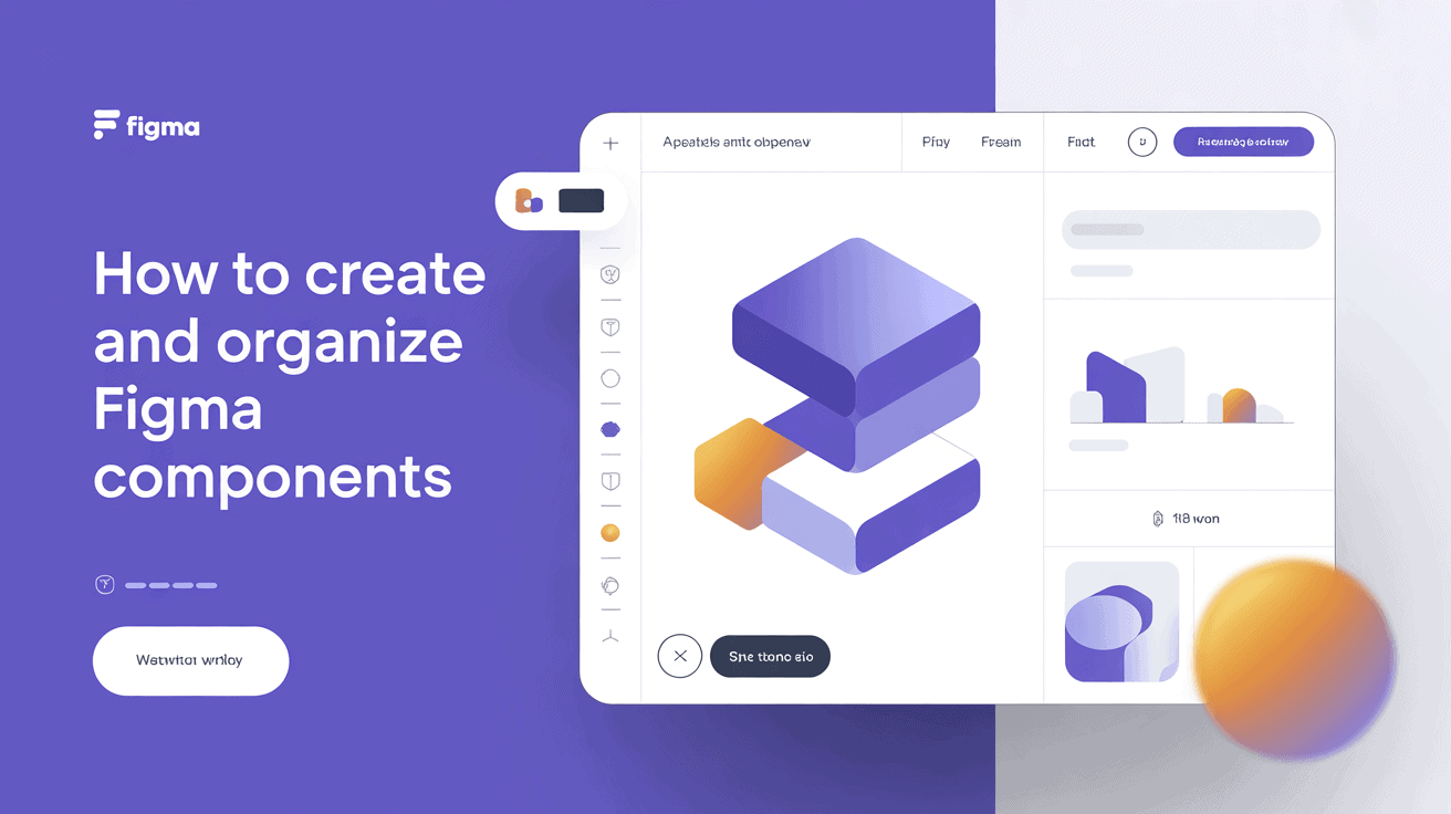
Key Takeaways
- Figma components serve as a single source of truth. You can update a master element once, and it updates in every instance across your project instantly.
- Standardizing your design workflow with components makes your files lighter and your system less cluttered while ensuring consistent naming, padding, and font standards across your team.
- By nesting these atomic building blocks, such as buttons and text fields, you can create complex, responsive layouts, letting your design system scale as project demands grow.
- Use component properties like variants, booleans, and instance swaps to handle multiple states and variations without creating separate masters.
- Take an atomic design approach to user interfaces by decomposing them into smaller pieces. These reusable components construct more robust and modular design systems.
- Keep your library tidy with consistent slash-based naming conventions and clean page structures to optimize searchability and developer handoff.
===
Creating Figma components involves building reusable design elements to maintain consistency across complex digital projects. You save time by creating standardized buttons, icons, or navigation bars in one master file.
When you update these masters, the changes automatically sync across every instance, which helps keep your design system clean and scalable. Designers utilize these tools to expedite workflows and minimize manual rework.
By doing this, you will be able to handle large interfaces efficiently and still maintain clean and accessible design files.
Why create figma components?
Figma components are the bedrock of efficient design work. They’re a single source of truth. When you update a master component, each instance throughout your project updates immediately. This not only saves you time but keeps your files clean.
Feature | Advantage |
|---|---|
Global Updates | Changes to a master update all linked instances. |
Reusability | Group elements like forms or navs for easy reuse. |
System Logic | Add interactive states to make designs feel real. |
File Efficiency | Reduces clutter by linking to shared libraries. |
Design consistency
By creating components, you make sure every button and icon appears consistent everywhere. You just edit the parent, and the change propagates to each screen. This eliminates the danger of human error when updating large batches of files.
To achieve design consistency, define strict naming rules for all layers. Set fixed font sizes and padding values. Use components to lock in spacing standards. Eliminate manual copies to stop visual drift.
Faster workflow
Standardizing your assets is key. Build a library of common symbols so you never have to redraw a standard icon from memory again.
Use slash naming: Organize your menu by naming items with a slash, like “Button/Primary/Active,” to keep the library tidy and easy to search.
Automate tasks. Focus your energy on solving big problems instead of repeating boring, manual layout work.
Scalable systems
Nested components let you construct crazy layouts from simple bits. You can mix a little icon and text field to build a fancy form. This atomic approach keeps your system simple to scale as project demands increase.
Record how parent components correspond with children so teammates understand the system. When you tie these designs to developer needs, the handoff goes much more smoothly.
How to make a component in Figma
Making a component transforms static UI elements into reusable design assets. It is based on a master component that controls the appearance for all linked instances.
1. Build the base layer
Begin by organizing your shapes and frames into a neat hierarchy. Remove hidden or empty layers that weigh down your file.
Name your layers with descriptive, intuitive names so collaborators can locate them. Add layout grids to keep things pixel aligned and keep your design crisp.
2. Apply auto layout
Use AutoLayout padding and gaps so the container resizes naturally as content grows. You can set alignment settings so that icons and labels stay aligned.
For instance, create a button that stretches when you enter longer text. Test this by dragging the box’s edges to verify the inner elements shift as desired.
3. Create the component
Choose your layers and press Command + Option + K to complete the transition. You can right-click and choose ‘Create Component’ from the menu.
Keep your master components on a separate page so they stay neat and tidy. Be sure to add a concise description in the properties panel to make it easier for others to know how to use the asset.
4. Add properties
Use the right sidebar to add booleans or variants. These allow you to switch options such as icons or labels on and off.
Link text properties so your design setup mirrors your development code. You can use instance swap properties if you need to swap between different icon sets on the fly.
5. Test the instance
Drag a copy from your assets panel onto a new page. Change the text or colors to experience overrides in action without disconnecting from the master.
If you update the master, search for the update icon on your instances. You can reset an instance if your edits create unintentional visual bugs.
Mastering component properties
Component properties enable you to create adaptable layouts that conserve time and maintain coherence. With these controls in place, you sidestep creating a bazillion master components for single alterations. A master component contains the rules, whereas instances allow you to adjust things without destroying the original.
Property Type | Function | Best Use Case |
|---|---|---|
Boolean | Toggle visibility | Showing or hiding icons |
Text | Edit content | Updating labels or headings |
Instance Swap | Switch elements | Changing icons or avatars |
Variants
Mastering component properties keeps your UI kit neat and accessible. Map the state change through the variant property to simulate real-world usage. Make sure each variant adheres to the same naming convention so your team can locate them easily.
Experiment with these changes in the component playground to witness their impact on your system.
Booleans
Add toggles switches to show or hide sub-layers in an instance right from the right sidebar. Here’s a brilliant technique that makes complex layouts less terrifying: hiding. It’s about mastering component properties.
You keep a single master component for several variations. This cuts down on the manual clutter lurking in the panel and keeps your workspace tidy.
Instance swaps
Give instance swaps to alter icons or avatars in a menu or list. Nesting icon sets inside a selector helps maintain your library’s organization. Team members select the appropriate version from a dropdown.
This maintains sizing consistency when you exchange elements of varying types.
Text properties
Connect layers to text properties for quick content updates in the instance. This allows designers to modify text fields without having to drill down into multiple layers.
Map individual labels such as placeholders, headers, and controls. You can even avoid broken layouts by constraining long strings of text to fixed limits.
Change a variable once and it updates them all. It offers central control and updates for everybody are simple. If you notice a mistake, correct the base component to make the change everywhere.
Keep in mind that overridden properties appear in the panel, aiding your change tracking. Mastering component properties guarantees consistency and pays back hours of repetitive work.
How to use components in figma
Components are effectively the atoms of your design system. A main component defines the source of truth, while an instance is a customizable copy that you sprinkle across your files. You can build these from vectors, groups, or frames using the shortcut Ctrl+Alt+K or Cmd+Option+K.
Accessing assets
Open the Assets panel on the left sidebar to browse your library. Search by name or category to filter.
You can explore individual files or folders to locate the appropriate one. After choosing a component, simply click and drag it onto your canvas to insert it into your frame.
Placing instances
Make sure you’re working with an instance and not a detached layer so your design remains connected to the master. Use grid properties and auto layout to keep your pieces aligned.
Clean up your library menus with slash naming like “Button/Primary.” Glance at the layer hierarchy to make sure the instance is located in the right group and isn’t buried too deep.
Applying overrides
You can modify text, colors, or icons on an instance without detaching it from the component. This protects your original master design and allows you to customize particular screens.
If a layout gets messy, check the override history and roll changes back to default. Try to keep heavy overrides to a minimum to maintain your overall file performance fast and smooth.
Organizing your figma components

Neatly maintained files save time at handoff, particularly when teams bypass third-party tools. When properly sorted, it’s much faster to find things in the assets tab.
Naming conventions
For example, use a crisp structure such as [Category]/[Type]/[State]. Name an icon icon-16-home to indicate its size and function. This keeps you from generic names like Frame 1 that litter your system.
Everyone on the team needs to follow these guidelines. It reduces search time immensely. Document your naming logic in a central guide. We all have to see it.
- Group items by category.
- Keep names short but descriptive.
- Use folders for related parts.
- Audit files monthly to remove duplicates.
Page structure
Build separate pages for different requirements. Keep your docs, playground, and assets on separate tabs to stay clean.
About: Keeping your figma components tidy. Always make a separate “dev” page. This way, developers can easily find what they need without wading through experiments or ancient drafts.
Save experimental layouts on a different page to be sure you don’t mess them up. Use BIG, CLEAR HEADERS so everyone knows what to look for.
Component documentation
Add notes to each component in the sidebar. Describe when you use a piece and how it functions. If you have code, link to the matching react component to assist your devs.
Update these notes whenever you modify a piece. You can use Auto-Layout to still keep things flexible. Set horizontal and vertical constraints to easily scale your components.
That prevents you from scrolling excessively. When you utilize a hierarchy, the entire system feels neat.
The component mindset
Taking a component mindset is shifting away from sketching fixed screens. You begin to see your interface as a set of composable components. This flow closes the design-to-dev gap and makes sure what you construct in Figma converts cleanly to code.
Think atomically
The component mindset. Think of buttons, icons, or text fields as atoms.
Coalesce these atoms into molecules, such as a search bar or a card, before you graduate to complex layouts. This keeps your file lean and efficient.
Reuse these small blocks globally, and you establish a single source of truth. Each instance remains attached to the original component, so changes occur all over the place at the same time.
Plan for change
Build components that gracefully manage content changes. Take advantage of auto-layout, so things wrap or grow when text does. It stops your design from shattering when real data is inserted.
Think in terms of components. If you have to replace a version, a well-defined route means you can swap out stale components without a human mistake.
Thinking in global changes early keeps your project structure stable as it grows.
Design for reuse
Comment: Generic parts that fit lots of places. For example, construct a reusable modal or dropdown that functions throughout your entire app.
Don’t create one-offs that bloat your library.
Slots are for keeping components flexible. By pulling one component into a slot, you establish a modular system. That way, you can swap in local combined components without cobbling together something new.
Have the finish line in your sights as you reassemble those pieces. If you construct with actual components, the engineers can read your reasoning.
This eliminates guesswork and smooths the handoff considerably. Constantly question whether a new piece is actually necessary before you add it to the system. This keeps your library slim and eager for new modules.
Conclusion
Construct your design system using intelligent components to optimize your time. You acquire velocity by repurposing across your files. You keep your team literally on the same page with consistent styles. Begin modestly with easy buttons to master components. Try them in different states to see how they behave in your layout. Arrange your library to assist them in seeking. Good habits today simplify your tomorrows. You reduce the likelihood of mistakes in your end deliverables. You help your team move faster with clear standards. Try it today. See our advanced variants guide to learn more about scaling your system.
Frequently Asked Questions
What is the main benefit of using Figma components?
Components enable you to craft design elements that can be reused. When you change a master component, any copy of that design across your project updates automatically. This is a huge time saver and keeps your designs consistent from screen to screen.
How do I turn an object into a component?
Choose the layer or group you’d like to convert. Hit the ‘Create Component’ button in the top toolbar, or use the shortcut (Cmd + Opt + K on Mac or Ctrl + Alt + K on Windows). Your object is now a master component.
What are component properties?
Component properties enable you to customize instances without unmounting them from the master. You can turn things on and off, swap out text, or alter booleans. This results in fewer individual components to create, making your design system much cleaner and easier to manage.
How do I use an existing component?
Open the “Assets” panel in the left sidebar. Locate the component you require and pull it into your canvas. This generates an “instance,” a linked duplicate of your master component. You’ll be able to then drag and drop it wherever it is needed in your design.
How should I organize my components?
Use slash naming conventions to bundle similar things, like “Button/Primary” and “Button/Secondary.” Having your components contained in either a page or separate library file keeps you organized. This allows your team to locate the appropriate assets easily.
Can I change an instance without affecting the master?
Yes. You can override certain properties of an instance, like the text or a color, without affecting the master component. These overrides are specific to that instance only. If you want to undo your changes, you can reset the instance to the master.


