Key Takeaways
- Figma UI kits are crucial collections of prebuilt design assets that connect the dots between concept and production-ready designs. With these kits, designers cut out busy work and speed up their entire workflow.
- A professional UI kit is built on grid systems, text styles, and color variables that keep every screen in your project visually consistent. Setting these constants upfront avoids a choppy layout and gives a cohesive brand look.
- Good documentation is a necessary map, giving your team a guide for how and when to implement components properly. This lessens the risk of design drift and keeps the quality high across large projects.
- Designers should separate a UI kit — an actual component library — from a design system, a living set of principles and strategies. Both are required to create scalable, quality digital products that stay maintainable.
- Scalability demands discipline, like descriptive naming conventions and atomic component structures. These strategies optimize file performance and keep designs consistent as the product scales across platforms.
- Complete design systems go beyond visual properties and include motion principles, content guidelines, and accessibility standards. Leading with these priorities makes intuitive, inclusive experiences that work for everyone.
===
A figma UI kit and design system offers a common component library for constructing cohesive digital creations. You leverage these pre-coded components to accelerate your workflow and maintain consistency across large projects.
Things like typography styles, color palettes, and interactive buttons that teams update in one place. By following these conventions, you minimize mistakes and waste during production.
The below sections teach you to build your own system.
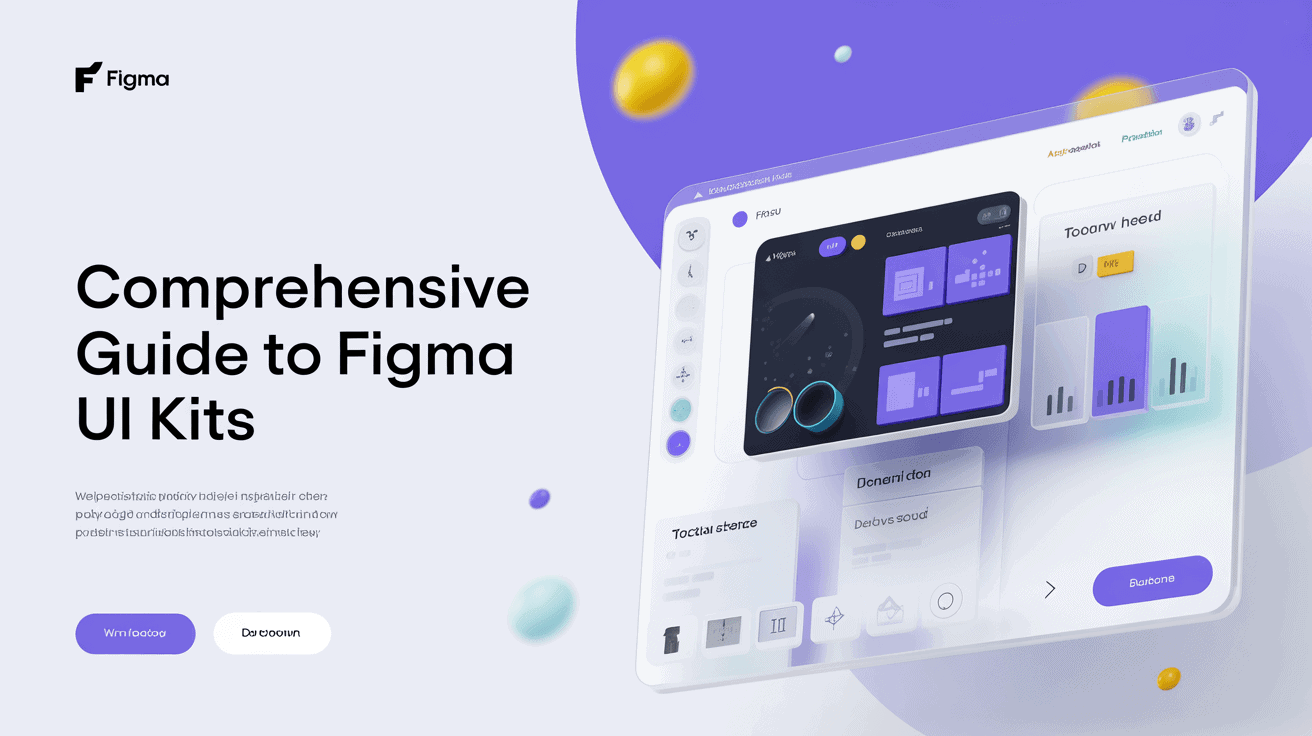
What is a Figma UI kit?
What exactly is an untitled UI kit in Figma? It serves as a middle ground between primitive design tokens and complete UI components. With these individual UI kits, teams cease to build generic parts like buttons or modals from scratch, ensuring high visual polish and consistency across every web design project.
1. The foundation
Base components are the heart of any pro kit. These range from grid systems and layout guides that keep your work on an even keel.
Variables and tokens form the foundation for modern systems. You need to establish these constants prior to constructing elaborate screens. This forms a single source of truth.
2. The components
Core elements such as buttons, dropdowns, and checkboxes are designed to be reused across multiple screens to save time.
You can make parts dynamic using variants and smart properties. Beautiful components reduce grunt work in fast prototyping. Proper naming, such as Input/Default, keeps your team sane.
3. The styles
Global styles maintain your file looking cohesive. Text styles and color variables, for example, are essential for management.
Uniform typeface prevents cluttered layouts. Changing one style updates the entire document at once.
4. The documentation
Documentation acts as a guide for your team. It describes how and when to use various components of the kit.
Explicit guidelines prevent design drift. You want to carry accessibility specs and technical details here. This gets us all on the same page about what we’re designing for.
5. The examples
Such as example pages that demonstrate how a kit operates in an actual product. You could design a dashboard or landing page to display your components.
These mockups serve as inspiration to new users. Maintain a library of screen designs to observe how the system scales.
It demonstrates the scope of your kit. A kit isn’t a full system, but it’s an essential beginning to one. It’s a pain to build, but the time you will save down the road is huge.
For instance, you can categorize content into Foundation, Components, and Patterns to stay neat. When you get beyond 30 components, solid organization is imperative!
Why use a UI kit?
A UI kit is basically a starter library of pre-built components, including buttons, typography, color palettes, and more. These assets are the missing link between initial ideas and production-ready assets, reducing duplicate effort. By using standard components, the UI kit teams minimize design mistakes and ensure the design is consistent across all digital touchpoints.
Some benefits of using a UI kit include:
- Significant reduction in repetitive manual tasks.
- Faster transition from wireframes to high-fidelity prototypes.
- Lower project costs through minimized design rework.
- Clearer communication between design and development teams.
Unmatched speed
Pre-built components allow designers to ship prototypes in hours instead of days. You just drag and drop buttons or forms onto the canvas, which keeps the workflow humming. This eliminates the ‘blank canvas’ paralysis that typically kills new projects.
With proven patterns, your team moves from low-level pixel-pushing to high-level UX. Efficiency gains can be ten times to one hundred times depending on the scale of a project. You spend less time constructing shapes and more time addressing real user issues.
Absolute consistency
Standardized files remove jarring UI distinctions from page to page. When each designer reaches into the same shared library, the whole project breathes as one. This consistency establishes brand trust and allows users to flow through your product seamlessly.
Centralized styles keep your interface consistent across mobile, tablet, and desktop. Even if your kit begins as a rudimentary set, you can polish it as you go. It offers a dependable foundation that preserves your design vernacular throughout the project expansion.
Effortless collaboration
Centralizing assets keeps large teams in lockstep. When you edit a component in a shared library, the update syncs to all open files. This keeps everyone literally instantly on the same page.
Standardized naming conventions allow developers to know your intent without additional documentation. Shared libraries encourage improved communication among designers, product managers, and developers.
Customizing it for your specific need might mean more time, but it’s still way faster than zero to sixty.
UI kit vs design system

UI kit vs design system. While both tools share the goal of accelerating work and maintaining consistency, they play different roles in a project. An individual UI kit serves as a toolbox for short-term projects, whereas a design system embodies a holistic philosophy about how those pieces, like untitled UI components, exist and evolve.
Feature | UI Kit | Design System |
|---|---|---|
Scope | Lightweight and flexible | Comprehensive and scalable |
Content | Symbols, icons, components | Guidelines, principles, code |
Purpose | Rapid prototyping | Long-term product maintenance |
Complexity | Best for small projects | Best for complex environments |
The tangible asset
A UI kit is the actual collection of icons, buttons, and text styles you pull onto a canvas. In other words, consider it a box of building blocks to aid you in beginning a screen without sketching out each shape by hand.
These are specific, versioned, easy-to-edit assets that provide the hands-on sensation required to rapidly construct interfaces. A kit keeps spacing and visual foundations tight, avoiding the mess of reinventing the wheel.
It’s the Goldilocks zone of design — not too free, not too regimented. Even if you’re working solo, a tidy kit keeps your files neat. Most teams begin with a humble kit and graduate into a system as their needs evolve.
The living framework
A design system is not a file. It’s alive and grows as your product grows. It contains the documentation, brand guidelines, and code definitions for how the UI kit components should function.
By encapsulating the “why” of the design, it guarantees the whole product ecosystem remains aligned as time passes. This foundation is critical for sustainable upkeep.
Once you start defining patterns and rules, you establish a source of truth for your entire team. Constructing a system might seem overwhelming.
You can start with your existing kit and gradually document it. This approach creates a clear path for future contributors. It makes scaling your digital product much easier.
How to use a UI kit
About how to use a UI kit Download a file, create a new project, and you’re off to the races. First, check the directory structure to find the ‘Getting Started’ and ‘Components’ pages. Take a quick inventory of them to check if they suit your project requirements.
Link your local styles to the master import to maintain everything in sync. Use these assets from the Assets tab in the left sidebar.
Find your kit
Search the Figma community for kits that fit your project scope. Tip: Seek out kits with deep component libraries that match your tech stack.
Check reviews and changelogs for frequent updates by the creator. Select a kit that’s easy to customize to your brand. Don’t forget that kits with 30 or more components should be broken up into multiple pages.
Enable the library
Publish your kit as a team library so we maintain a stable link between files. This provides superior version control and separate testing.
Confirm that all styles and variables are attached to this library. Store your library apart from your work files to prevent inadvertent edits.
Customize the styles
Switch up the global colors and typography to suit your visual needs. Don’t mess with the skeleton of components, even if you change the appearance.
Employ local overrides sparingly to avoid breaking the system. Test your changes at different screens to verify the visual impact. Make sure to reserve a “Symbols” page for master components feeding other pages.
Assemble your design
Use auto layout so your screens remain responsive. You can nest primitive components to construct more complicated features such as nav bars.
Drag assets from the Assets panel, not copy from old files. Create high-fidelity screens that simulate real app behavior.
Try making a layout component that allows you to toggle themes. Keep in mind that certain front-end components may not be included in the kit and be conscious of these constraints.
Tips for using a UI kit include structuring your files into folders such as ‘Foundation’ and ‘Components’, which makes it easy to maintain over time. Updating one symbol will push changes across your entire project, saving you tons of time.
Building for scalability
Scalability depends on a hard framework, not mere visual flair, as projects scale. You need to architect for iOS, Android, and web right from the start. By testing at 1x, 2x, and 3x density, you are ensuring your system scales across devices.
Keep in mind that a design system is a living product that needs continuous attention.
Strategy | Benefit |
|---|---|
Modular components | Improves file performance |
Design tokens | Ensures visual consistency |
Branching | Safely tests new updates |
Naming conventions
Such consistent labels, e.g., Category/Component/State/Size, accelerate team searches. It prevents asset confusion.
Normalize these names to frontend code keys. This bridge streamlines handoff for developers.
Component structure
Build atomically, from tiny symbols to scalable modules. Use properties and variables to keep things flexible.
Minimize layer counts to conserve memory, with files topping out at 2GB and smaller. Reusable parts, such as a button, can be five parts high in the hierarchy and keep things zippy.
Do check contrast against WCAG 2.2 standards for accessibility.
Version control
Establish a system update schedule. This makes things predictable for your team.
Branch or test files to clean things up before you bring them in! This keeps the core library stable.
Maintain a changelog for new features. This keeps everyone up to date on modifications.
Archive outdated library versions for legacy projects. This way, you don’t break existing work.
Beyond the interface
A design system goes way beyond colors and shapes, encompassing essential elements like individual UI kits and untitled UI React components. It captures the soul of your product in behavior and logic. By describing how a system feels, you guarantee it will be consistent on each individual device, ensuring a modern UI experience. If a selection doesn’t simplify a user’s life, rethink it.
Motion principles
Beyond the interface, standard easing curves and durations give zing to your interface. A button click requires a subtle, quick response to confirm an action. You can map out these transitions using Figma’s prototyping features.
Just-in-time trust is essential. Motion navigates the user through intricate activities. It makes a screen change seem slick, not jarring. When you specify such rules, you transform a rough static layout into a breathing, living tool. This distinction is what separates design from work.
Content guidelines
Words are integrated into the layout. Use these rules to stay clear and helpful:
- Keep labels short and direct.
- Use real data in placeholders to show true scale.
- Date and number formatting that suits your global audience.
- Write your error messages like it is a lesson on how to solve the problem.
- Ensure all text meets basic reading levels for everyone.
Implicit in a steady flow of writing is the construction of a dependable brand voice. It eliminates uncertainty for the user. When your writing is good, readers move through your article effortlessly. Accessibility is the name of the game here, inviting everyone in.
Accessibility notes
Colors need to achieve specific contrast ratios for everyone to be able to read them. Try dark and light modes too, just to be safe. Verify that keyboard navigation is solid for non-touch users.
Label your components explicitly for screen readers. This enables developers to create stronger tools. Focus states should be apparent for keyboard users. You want your touch targets to be big enough for mobile screens.
Appropriate spacing protects against missteps in use. It’s a never-ending task. You have to upgrade as platforms evolve. Keep your documentation live and fresh.
When you repair errors, facilitate their reversal. Always eliminate interruptions that obstruct the user. Feedback loops make the experience stay real. That’s how you build a product that lasts.
Conclusion
Design systems are time savers for teams. You construct speed with a solid UI kit. You maintain your projects tidy. These keep you on track. You screw up less on grand projects. They provide a delightful experience with your apps. Your work looks crisp on any screen. You waste less time on minutiae. You concentrate more on innovation. You scale your brand with these smart choices. A parts set makes your work easy. You share these components with your team. Everybody stays on the same page. You achieve your goals with less angst. Begin your next project with a bang kit today. See our guide to select the optimal tools for your requirements.
Frequently Asked Questions
What is the main benefit of using a Figma UI kit?
An individual UI kit saves you time by offering pre-made components like buttons, icons, and menus, enabling designers to construct consistent interfaces quickly without starting from zero for every new project using untitled UI.
How does a UI kit differ from a design system?
So what’s an individual UI kit? It’s a collection of visual assets and components, while a design system encompasses much more — it includes the UI kit along with documentation, style guides, and coding standards that describe how and when to use those assets.
Do I need to be an expert to use a Figma UI kit?
No. Figma UI kits, including the untitled UI React components, make for easy use! Just drag and drop these reusable components onto your canvas. Most kits come with setup instructions, so you can start with a base regardless of your skill level.
Can I customize the components in a Figma UI kit?
Yes. You can customize colors, fonts, and sizes in Figma to suit your brand. Leveraging Figma’s untitled ui react components and “Variants” features, you can easily update these styles throughout your entire project at once.
Will a UI kit help my project scale as it grows?
Sure. With modular components from untitled ui react, your design is consistent as you add more pages, allowing teams to work together and iterate without adding technical debt.
Where can I find high-quality Figma UI kits?
Get them on our Figma Community page, where many makers offer free and paid ui kits. Keep an eye out for untitled ui react files with high download numbers and most recently updated, as they are a good indication of modern design best practices.