Key Takeaways
- Designed for team collaboration, Figma allows teams to collaborate in real time, simplifying the design process and enhancing communication across the world. Invite stakeholders to your files early to get immediate feedback.
- Component-based design keeps consistency in your mobile wireframes. Create a library of reusable components to expedite your work and keep your interface consistent across the project.
- You can prototype to test user flows and interactive links before stepping into the high fidelity design. Concentrate on the functional flows that show how a user will move through your app.
- Figma mobile wireframe designs with thumb zones. Position primary interactive elements within easy reach for a comfortable experience on all hands.
- Create an explicit content hierarchy. Place useful information prominently, aiding users in accomplishing their objectives swiftly and with minimal clutter.
- Don’t over-design at the wireframe stage. Concentrate on structure and functionality initially because that prevents typical traps such as forgetting component states or layout constraints.
===
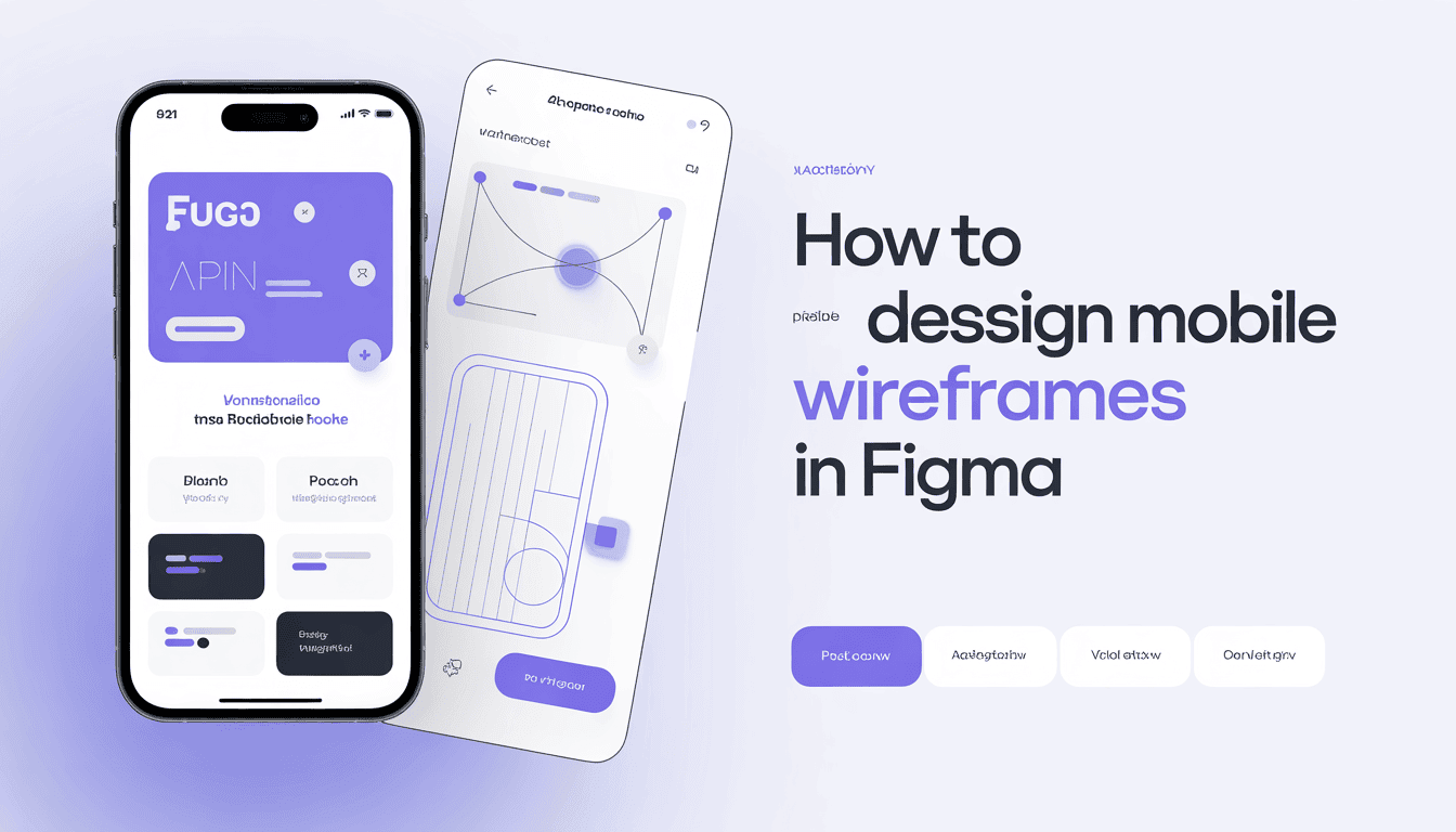
Figma mobile wireframe design involves creating low-fidelity blueprints to map out app layouts and user flows efficiently. Designers employ this tool to establish structural foundations ahead of incorporating visual details or high-resolution graphics.
You craft clean, responsive screens using components and auto-layout. These early-stage drafts help teams test navigation logic and spacing across different screen sizes. Taking a look at these fundamental architectural steps will give you a foundation for your future development work.
Why figma for mobile wireframes?

Figma serves as a versatile platform for mobile wireframe design, allowing teams to build clear, functional layouts. Prioritizing core navigation and user flows first allows designers to prioritize usability before embellishing with visual polish.
We use standard dimensions of 393 pixels by 852 pixels so sizing is consistent on mobile devices worldwide.
Real-time collaboration
Teams collaborate in one file at the same time. This way, you have immediate response and are all on the same page.
It eliminates the confusion about which design version is the most up to date. Designers and stakeholders can talk through requirements right inside the file.
It keeps meetings quick and user experience centric.
Component-based design
Build a library of buttons, icons, and menus once. Then you drag them everywhere on all your screens.
If you want to alter a navigation bar, you edit the master component. All instances update automatically across the project.
This saves you time and keeps the design neat.
Prototyping power
Designers tether screens together to demonstrate how a user flows through the app. This testing shows whether the flow is logical or broken.
You can test these early with real users. It helps you see where they get stuck.
Less easy, perhaps, making changes is easy. You can experiment without reinventing.
This liberty allows you to be bold. It helps you iterate the route until it functions.
Community resources
It has a lot of pre-made kits and templates. You don’t have to sketch out every box from scratch.
These files get you started fast. Choose a layout and customize it.
It’s a fantastic way to pick up new tips. A lot of creators give their work away for free.
You can look for inspiration for popular mobile patterns. That way, you help solve problems without reinventing the wheel.
Create your figma mobile wireframe
About building your figma mobile wireframe. By keeping your designs simple at the start, you guarantee that the core flow is all that is important before you dress it up visually.
1. Establish the foundation
Begin by setting your frame size to 393 by 852 pixels. This common size assists you in better imagining how content fits on a contemporary display.
Take a Figma mobile wireframe. Make text generic, such as “Title” or “Body Text,” so it’s not a distraction. This low-fidelity style makes it easier for teams to settle on the structure without getting bogged down in colors or fonts.
2. Structure the layout
Arrange your components to expose hierarchy. Put the primary buttons where a thumb can grab them.
Make your navigation obvious so users never feel lost. Use plain text tags for menu options or back buttons. This neatly navigates the app logic to the user.
3. Build key screens
Design the key screens such as the home screen, profile, and search results. Think about the flow from one user action to another.
Don’t over design it. Don’t fret about perfection yet. Don’t worry, you can quickly modify these screens later.
Feedback reveals superior methods for organizing the content.
4. Add interactive links
Connect your frames on the Figma prototype tab. Connect buttons and next screens with lines to approximate a real flow. This assists you in determining whether the flow is logical.
Test the links to broken sequences. If a button goes to the wrong place, just drag the line. It’s a fast way to demonstrate the app to your team.
5. Share for feedback
Share your link to receive feedback. Use the comment tool to collect detailed notes on the flow or layout.
Hear the criticism with an open heart. You may discover that they get lost or that a button is hard to locate.
Take these learnings and update your design. Keep in mind that you want to optimize the user journey and not protect your original decisions.
Core principles for mobile design
Space and intent are guiding principles in mobile design. Armed with some simple wireframes in Figma, designers can test ideas fast without getting bogged down by high-fidelity minutiae.
Beginning with pen and paper allows you to sketch out flows before transitioning to digital tools to polish the structure.
Thumb-friendly zones
Most of us hold our phones in one hand. We use our thumbs to button-tap and scroll.
Put the most important actions, like a ‘Buy’ button or search, near the bottom of the screen. Don’t position key controls at the top corners. These regions are difficult to access for most users.
Keep your main touches within the bottom two thirds of the screen.
Content hierarchy
Hierarchy informs the user of what to look at first. Use size, weight, and contrast to make headlines jump out from body copy.
If it all looks the same, they’ll feel lost. Progressive disclosure is a clever solution for this. You display just the essential information upfront.
Then, you allow users to tap to expose more if they desire. This prevents the screen from becoming overwhelming or cluttered. It leaves the core flow clean and simple to follow.
Clear navigation
They need to know where they are and have a way to go back. Navigation needs to be obvious and consistent on every screen.
If a user has to hunt for the ‘Home’ icon, you’ve made a mistake. Employ simple, standard icons that users are familiar with from other applications.
Don’t be too clever with icons that might confuse a new visitor. Consistency really is the key to a good experience.
For example, if your “Back” button is top-left on one page, keep it there on all pages. This establishes trust and lets the user master your app quickly.
When navigation is transparent, users focus on the work. They complete their objectives without aggravation.
Test your flow to ensure the path is as direct as possible. If a user gets stuck, boil the steps down until the path forward is clear.
Common figma design pitfalls
Designers build mobile wireframes in Figma and run into common issues. These mistakes will slow down your workflow and cause technical debt down the road.
Ignoring constraints
Not setting up constraints or auto-layout properly leads to designs breaking when screen sizes change. If you don’t test how these shift on various devices, your layout will be wonky.
For example, 0.5px strokes frequently give rise to mobile rendering issues. Dismissing a system-first strategy implies you wind up with redundant work. You always want to link it to a master component so you don’t have to update them manually.
When you edit a button style rather than editing the component, you generate inconsistencies that developers have a tough time patching up. Little things, like a 2-pixel gap difference can cause major headaches in the build phase.
Over-designing early
A lot of designers throw in high-fidelity colors, gradients, or complex effects before the skeleton is locked. This practice is a waste of time.
Another trap is using lorem ipsum. Real content lets you see if your layout really works for the user. If you design with placeholder text, your headings may end up being too long for the mobile screen once you add real text later.
Templates are great. You have to make it your own. If you merely plagiarize a template, your app will resemble every other boilerplate design.
Start with the page skeleton. Always pay attention to how the user transitions through the app rather than how it appears.
Neglecting states
Designers often overlook mapping out all states, such as active buttons, error screens, or loading screens. This gap results in user experience holes.
Without a design system, motion design is messy. You might have different transition speeds or effects across the same app. This inconsistency confuses the user.
Consistency is the secret to a smooth build. If you specify your hover, click, and disabled states early, you’re saving time.
Make sure each transition fits your global system rules. This avoids technical debt and simplifies the developer’s task.
Beyond the wireframe: what’s next?

Wireframes are the blueprints of any mobile project. They enable teams to get on the same page with core requirements while keeping design conversations targeted and efficient. By valuing usability above flair, these initial sketches guarantee that the creative force stays focused on the core details of the user experience. This stage allows the freedom to try out new ideas, try layouts and essentially take risks without the restrictions of high fidelity styling.
Beyond the wireframe: what comes next? Simply leaning on menu lists is hardly ever the solution. You have to think carefully about information architecture so that the flow actually feels natural. For content intensive applications, swapping out typical lorem ipsum with your actual content allows stakeholders to truly understand what the final experience will look and feel like.
No matter if you’re constructing a low-fidelity sketch to map a user journey or a high-fidelity prototype to polish specific interactions, the objective is to promote clear communication. The appropriate level of detail, of course, depends on where you are in the design process. Early stages involve simple lo-fi wireframes to keep the conversation open.
As the project matures, this additional detail helps developers get a sense of the technical requirements and constraints. You’ll begin to know these designs are working when they bridge, in just an instant, the gap between team members and stakeholders. If your wireframe generates useful input and gets everyone on the same page, it has done its job.
These blueprints are more than just images. They’re used for team feedback and developer handoff. With simple shapes and obvious labels, you sidestep any unneeded confusion and stop stakeholders from obsessing over colors or fonts. This clarity drives the project to continue moving forward with momentum.
When you bring others in to comment on your Figma files, focus the attention on the logic, the structure of the mobile experience. This pragmatic approach makes sure that moving from wireframe to slick design is a natural progression. By striking this balance, you generate a dependable roadmap that guides the development team throughout the life cycle of the project, resulting in a more cohesive mobile product.
The future of mobile wireframing
Mobile wireframing continues to take strides toward minimalism and intuitive user navigation. Design teams specialize in creating interfaces that seem intuitive. I believe that sticking to standard sizes such as 393px by 852px is still the best way to maintain consistency across devices. This frame size aids designers in sketching wireframes that will translate well to modern phones.
Early design stages are still low-fi sketches. Teams commonly use placeholders to demonstrate where videos or images will be placed. They employ placeholder text to chart the overall information flow. This way you stay focused on the app’s structure, not its appearance. It prevents designers from becoming too attached to tiny details before the layout is concrete.
Platforms such as Figma will still accelerate a lot of the way teams collaborate. These platforms assist us all to collaborate and provide feedback in real time. As we look forward, this transition to real content over placeholder text will increase. This shift assists teams visualize the way text and imagery interrelate in content-dense apps. It provides a greater feeling of how the user will really ‘feel’ the interface.
It’s not just how a wireframe looks that determines success. Designers need to concentrate on user flows, particular scenarios, and the navigation ‘feel’. Testing these wireframes with actual people gives you the most invaluable feedback. By listening to their users, teams can find out if their ideas really address issues. It’s about creating something that works for the person holding the phone.
Great wireframes strike a balance between simplicity and just enough detail to be helpful. Designers should consider these sketches as living documents which shift and change with testing. Leaving the process open to change allows teams to sidestep common traps and remain user-centric. This way of thinking guarantees that what eventually gets built is useful, usable, and beneficial for all.
Conclusion
About figma mobile wireframe design Mobile design requires distinct stages to come to good results. You now have the appropriate tools to construct layouts in Figma. You know the basics for little screens. You can catch basic errors quickly. These wireframes help you plan user paths before you add final colors or photos. Get your work into its simplest form and pay attention to the user flow in the app. Test your ideas with real people to validate the flow. Great apps start with great plans. You spend less time and money correcting at the end. Get started on your next mobile project today. Open your Figma dashboard and sketch your first screen layout today.
Figma wireframe resources: Figma Help Center and Figma Community.
Frequently Asked Questions
Why is Figma better than other tools for mobile wireframing?
Figma’s browser-based, so it’s easy to share and collaborate in real-time. Its powerful component system and auto-layout features make it easy to scale mobile designs. It has the advantage of providing a smooth transition from low-fidelity wireframes to high-fidelity prototypes all within one platform.
What are the standard dimensions for a mobile wireframe in Figma?
Screen sizes come in all shapes and sizes, but 375 by 812 is a typical starting point for mobile wireframes. This size simulates the aspect ratio of most contemporary smartphones. Leave behind the days of pixel guessing and extend your design directly onto one of Figma’s preset mobile frames.
How do I use components to speed up my mobile wireframing?
Make components for common things like navbars, buttons, and icons. If you update a master component, all instances throughout your wireframes update automatically. This time savings keeps your design consistency intact across the entire mobile project.
What is the most important rule for mobile wireframe design?
Concentrate on user flow and function over appearance. Keep your wireframes in grayscale with basic shapes. The idea is to create a clean layout and intuitive navigation before you introduce heavy visual design.
How do I test my Figma wireframe on a real mobile device?
Try out your prototype on your own phone. Either use the Figma Mirror app or open your prototype link in your mobile browser. This lets you experience your design on a touch screen. By testing on a real device, you ensure touch targets are big enough and the layout feels natural.
What are common mistakes to avoid when wireframing for mobile?
Don’t overload little screens with too much information. Make sure your touch targets — buttons, etc. — are at least 44 x 44 pixels. Don’t forget the “thumb zone,” which is the part of the screen that is most easily accessible by a user’s thumb.