Key Takeaways
- Dynamic page transitions make your site feel faster and give your visitors a professional, immersive experience. You want to use these animations to hide loading times and keep your website looking seamless.
- Build your transitions by having fixed or absolute ‘top’ and ‘bottom’ divs covering the full viewport. Give these elements different class names so you can control their states in the Webflow interactions panel with ease.
- Make sure your animation duration is in balance with real page load speeds. Too slow can feel sluggish. Don’t forget to put a short delay between the end of the animation and the page navigation to make sure that the effect has finished.
- It’s important to respect user motion preferences and keep your navigation accessible. Test your transitions on different devices to avoid layout shifts or touch issues on mobile.
- Focusing on performance by using native CSS animations over heavy JavaScript code. This offloads rendering to the browser and helps preserve a smooth frame rate even during complex transitions.
- Make a reusable transition block or template to simplify your work across projects. This keeps brand consistency and lets you scale your design system.
===
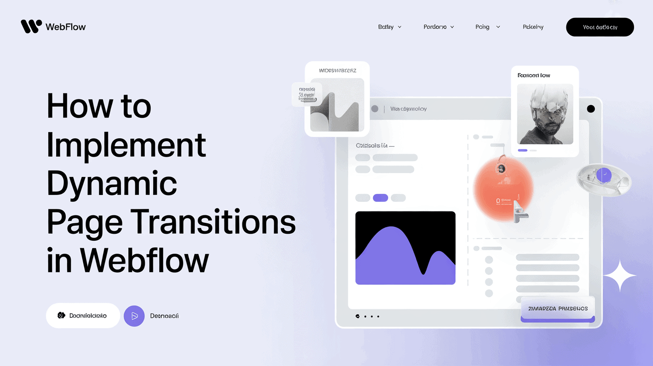
Webflow dynamic page transitions animate transitions between site pages using native animation settings. You have control over these effects by tweaking opacity, scale, and easing curves in the interactions panel.
These apply to all CMS collections for a seamless motion experience throughout your site. When they are set up properly, it reduces visual stiffness and makes user navigation paths more natural.
Using these targeted animation triggers makes your content load with a smooth sense. The sections below describe how to set up these fluid transitions.
Why use dynamic page transitions
Dynamic page transitions connect the divide between individual pages, transforming a simple click into a seamless glide. By animating the connection between states, you prevent the abrupt jump that occurs when a new page loads. Such a tiny design decision transforms the experience of visiting your site. It makes the site feel more like an app and less like a bag of files.
They conceal the loading time of a page. If the visitor clicks a link, they’re accustomed to an immediate reaction. If browsers need a second to load data, a nice exit or entry animation masks that lag. The site seems a lot faster since the transition gives the user something to do. It transforms a dull pause into an intentional visual signal that the next page is coming.
Branding is about those little details that separate a site from a cookie-cutter template. Putting in custom webflow page transitions demonstrates to your readers that you care about the polish of your work. It generates a premium experience users sense immediately. As a brand uses consistent animations, it establishes another layer of trust and makes the navigation feel deliberate.
It informs the visitor that they are in a place created thoughtfully. Fluid animations serve as a signpost for the visitor. When you transition from a homepage to a portfolio, a gentle fade or slide retains the attention of your audience. These transitions maintain continuity, keeping users on track as they navigate.
It gives crucial feedback that the system has acknowledged their action. Keeping it all connected, you minimize cognitive overhead from surfing. Apps like these are an easy way to add visual appeal to any project. It makes the experience less robotic and more human.
Instead of a jarring switch, you give the browser a moment to catch its breath. That’s the magic of this tactic — it works for any kind of site, from creative portfolios to bustling online stores. It keeps the user hooked by treating each experience as a component in a larger, carefully crafted puzzle.
Each motion has meaning, keeping the user rooted in your content as they navigate your digital environment. It’s a detail that enhances your site’s polish level.
The core implementation process
Constructing animated transitions involves a system of layers and timings, especially when utilizing webflow page transitions cloneables. You need to pay attention to the layout architecture to achieve a seamless transition and good visual flow around your site.
1. The structure
Begin with the ‘top div’ and ‘bottom div’ in your navigator panel to create a seamless navigation experience. Give these a fixed or absolute position so they fill the viewport and assign them distinct class names to control them easily in the interactions panel.
2. The animation
Make keyframe-based moves like fades or slides to these divs for a stylish page transition effect. Set the open and closed states with the Webflow interactions panel to enhance user engagement. Play with opacity or width animation to create a curtain or cool page swipe effect.
3. The timing
Fine-tune the speed of this transition with page load times so things don’t feel sluggish. Fix the same duration to all pages to maintain your design cohesion. I’d recommend some small delay between the animation end and actual page jump. This guarantees the user experiences the complete impact.
Synchronize these timings with whatever pre-loader you may utilize.
4. The triggers
Associate actions to mouse clicks on your links to enhance user engagement. Trigger the motion for a seamless transition effect when a user visits a new URL via element trigger in Webflow. Utilize global triggers for all internal links to maintain the experience and ensure smooth animation.
5. The code
Catch link clicks with JS, and suspend navigation until animation completes. A basic setTimeout can deal with the redirect once the transition finishes. Target various link classes to execute these custom actions with ease.
Don’t write code unless you really have to. Rely on Webflow’s native tools for the core implementation.
6. The design
Use your transitions as narration, not ornament. Ensure each move strengthens the connection between pages. Choose styles that match your brand whether it is minimal or bold. Concentrate on the in-between moment to maintain users’ attention while the subsequent page is loading.
Testing these interactions is essential to make sure they come across as fluid and intuitive on various devices. By optimizing the easing and duration, you produce a slick experience that reads as deliberate and premium to any visitor.
The transition philosophy
![]()
A considerate seamless transition philosophy bridges distinct site states, creating navigations that seem organic and enhance user engagement. With tools such as Ease In Out, you can achieve smooth animations that come across as natural rather than abrupt to the audience. Regardless of whether you opt for a fast 0.4s snap or a slow 0.75s fade, your transition philosophy should always center around serving the user.
Performance
Concentrate on high-speed CSS animations so your site remains speedy on older phones or slow computers. Don’t do heavy JS math that will lock the browser as a new page loads. Utilize Webflow’s native interactions to let the browser do the heavy lifting, helping you achieve a buttery smooth 60fps.
A quick tip: always balance your animation complexity with the heaviness of the page. If a page is massive, hold the transition light for fear of lag.
Accessibility
Always respect users’ browser settings for prefers-reduced-motion. If they request less motion, enclose your code in a media query to disable it.
Don’t forget to allow keyboarders to navigate through your site with ease. Solution: The transition philosophy.
Try to keep your motions smooth so you don’t irritate folks with photophobia. If transitioning loading moments, leverage high-contrast overlays to ensure any text is readable.
Branding
Design a personalized template that fits your brand aesthetic. Apply particular color swipes or gentle opacity shifts to make the site seem like a luxury moment and not a transaction.
Link your transition philosophy to the design system. This maintains the appearance uniform across all pages.
You can hook your actions to CMS entries. For instance, apply metadata to alter a transition’s color or speed depending on the category of a blog post. This helped keep the animation personalized to the content.
Use this same logic for all collection templates. If your architecture deals with data properly, the transition remains snappy. It transforms a basic page load into a boutique online happening that affirms your agency’s craftsmanship.
Integrating with content management
Webflow’s CMS is the hub for your digital assets, allowing you to manage content such as blog posts, product catalogs, or team profiles all from a single location. Everything is visual-first, so you’re designing your site and building it simultaneously, which makes linking your dynamic Collection pages to your transition logic a lot easier.
Because the dynamic content is sourced from one source of truth, any changes you make in the CMS will appear throughout your site automatically. This configuration is great for maintaining continuity. If you’re using a two-stage publication system, such as dev to staging to production, you have an opportunity to review your work before the world does.
When you apply transitions to these dynamic pages, begin by auditing your custom code. You need to ensure your logic won’t break how the browser back button works. If users click back and the page doesn’t load properly, your transition may be interfering with browser history.
Try this flow frequently. Then, examine your z-index stacking. If your transition overlay lays under a button or menu, it will appear glitchy. You have to make the z-index of your overlay high enough so it stays on top of everything else while it is doing it.
Flicker is a problem. This typically occurs when the browser attempts to display the new page prior to completion of the transition. To correct this, ensure the destination page hits a fully ready state before the overlay vanishes. You can use a small delay or a loader to keep the screen clean until the content is ready.
Last, check your URL redirection logic. Every link you click has to lead precisely to the right characteristic. If your CMS is importing dynamic links, make sure the path is right for each and every Collection item. If the link is a bit out of whack, the transition may fire but point to a dead page.
You can bring in content to the CMS to accelerate your migration from legacy platforms. For bigger groups, the CMS manages version control and access, keeping the workflow secure. Treating your CMS as the backing, you’ll be able to construct slick page transitions that come naturally and professionally to all who visit your site.
Troubleshooting common issues

Webflow dynamic transitions can occasionally induce performance issues as projects increase in size. Problems like class bloat or render blocking scripts are often exacerbated by adding too many assets. You need to audit your JavaScript and optimize image sizes to halt heavy blocking states.
Keep your DOM elements light and profile your site with developer tools to isolate hardware-intensive filters that may be causing “jank.
Lag
Give your body tag a background color the same as your overlay to kill white flashes. Ensure your hidden state remains opaque until the logic begins. You need to sync your closing animation with the browser render cycle to prevent old page fragments from displaying.
Consider using the CSS will-change property on your transition elements. This instructs the browser to prerender the animation ahead of time, making the transition significantly smoother.
Flicker
Reduce your complex, layered animations to simple fades for mobile. Complicated layouts frequently break on little screens. Test your touches thoroughly. You want to ensure that a casual swipe down doesn’t mistakenly refresh a new page load.
Disable heavy effects for older devices to maintain site usability. Make sure your hamburger menus aren’t battling your page-wide transitions.
Mobile
See community clonables to see how others are handling shutters or rotation twists. These cases are excellent for learning how to tailor your layouts. Go for random effects by destination page. This provides a playful, professional flair that holds visitors’ attention.
Mix CSS filters and blend modes inside your overlays for that premium aesthetic. If you want to be fancy, use custom code or external libraries to add path animations that follow the mouse.
Your class system should be bloat-free and keep things manageable as you grow. If things still feel off, clear your cache, try an incognito window, or check the Webflow status page for outages. Taking care of these little technical things means every user, on any device, will get a perfect experience.
Pushing creative boundaries
Web design has evolved from simple text pages to multimedia interactive sites. This advancement enables creators to employ animations and transitions, such as stylish page transitions, to narrate and engage users. Striking the balance between audacious creative decisions and straightforward usability continues to be a big challenge.
Feel free to tap into WebGL for intricate visuals or GSAP’s Observer to launch smooth transitions as people scroll. These techniques help capture users and maintain their interest, enhancing overall user engagement.
Documenting your animation settings and custom code snippets allows you to scale your work across multiple projects. When you maintain an organized library of your timing and easing curves, you save time on future builds. This way, your rig stays solid and ready for implementing webflow page transitions cloneables.
You can quickly recycle these notes to offer consistent quality to each customer. Creating a reusable “transition component” is a clever new way to accelerate your process. By making a default set of transition styles in Webflow, you ensure that your design stays consistent from page to page, fostering a seamless navigation experience.
It lessens the necessity of beginning from square one every time. It lets you spend more time on the novel part of a project and less on rehashing elementary setup chores. Of course, you should adjust your transition timing and style panel settings to real-world user feedback and site metrics.
Observe users interacting with your pages to determine whether an effect seems sluggish or annoying. If users have a hard time finding their way, tweak your parameters toward ease of use. Data forces you beyond acting on assumptions and instead prompts changes that truly enhance the user experience.
To keep your process nimble, update your transitions as your skills develop. Pushing boundaries is about risk and experimentation. You’ll crash and burn early, but every experiment shows you what clicks.
Be open to change, and iterate frequently to remain fresh. As you gain experience with web interactions, you’ll organically develop a knack for building immersive experiences. This mindset keeps you on the cutting edge of a rapid-moving discipline and keeps your designs grounded and functional.
Conclusion
Dynamic page transitions close the distance between immobilized screens and flowing motion. Enhance user focus with smooth motion on your site. These nuanced movements direct the gaze throughout your design. Readers locate content quicker when things slide with intention. You prevent visitors from bouncing with clever design. A simple fade or slide makes any project a bit more professional. You check these effects to make sure they function on all screen sizes. Perpetual movement cultivates confidence and maintains the site velocity. You monitor user stats to understand how these modifications support your objectives. Begin modestly by incorporating a single, elementary transition in your main page today. Let us know how these motion effects alter your site traffic in the comments below.
Official Webflow resources: Webflow University, Webflow Blog, and Webflow Forum.
Frequently Asked Questions
Why should I use dynamic page transitions on my website?
Dynamic transitions, such as stylish page transitions, make users care because they create a seamless navigation experience that looks professional and smooth, setting your site apart from stale, conventional designs.
Do dynamic page transitions affect website performance?
To ensure a seamless navigation experience, it’s crucial to keep animations light and code efficient, which ultimately enhances user engagement and creates a smooth experience on every connection speed.
Can I use dynamic transitions with a Webflow CMS?
Yes. Transitions can be triggered from CMS data, allowing for a seamless transition experience. Here you can assign custom animations to specific categories or dynamic items, enhancing user engagement as users browse your collection pages.
What is the best way to troubleshoot broken transitions?
First, inspect your interaction triggers and target elements to ensure a seamless transition experience. Make sure your classes are properly named and that no conflicting CSS is overriding your animation settings, enhancing user engagement in your web design practice.
Will dynamic transitions work on mobile devices?
While most page transitions translate nicely to mobile, it’s important to keep it simple for a seamless navigation experience. Heavy animations may lag on smaller screens, so always test your webflow page transitions cloneables on different screen sizes to ensure responsive touch navigation.
How do I keep my page transitions consistent?
Create a global style guide for your animations to enhance user engagement. By employing consistent timing, easing curves, and movement patterns across your site, you ensure a seamless transition experience, preventing the user experience from feeling fragmented.