Last updated: May 13, 2026
Quick Answer: Building a professional WordPress navigation menu with Elementor takes five steps: create your menu structure in WordPress, add the Nav Menu widget in Elementor, style your menu typography and colors, configure responsive mobile settings, and add advanced features like mega menus or animations. The entire process requires no coding and works with Elementor’s free version for basic menus, though Pro ($59/year and up) unlocks the full Nav Menu widget and mega menu capabilities [7].
Key Takeaways
- WordPress menus are created first in Appearance > Menus, then styled and placed using Elementor’s drag-and-drop editor.
- Elementor’s Nav Menu widget (Pro) gives you full control over layout, typography, hover effects, and dropdown animations without writing CSS.
- You can choose horizontal, vertical, or dropdown layouts depending on your site’s structure and audience [7].
- Mobile responsiveness requires separate configuration: set your breakpoint, choose a hamburger icon style, and test on real devices.
- Mega menus allow multi-column dropdowns with images, icons, and CTAs for content-rich sites [10].
- Elementor powers over 13% of all WordPress sites, with 10 million+ active installs, making it the most widely used page builder for menu customization.
- Performance matters: use Elementor’s flexbox containers and limit unnecessary widgets to keep menu-heavy headers loading fast.
- Common problems like menus disappearing after updates can often be fixed by clearing cache and regenerating CSS files [9].

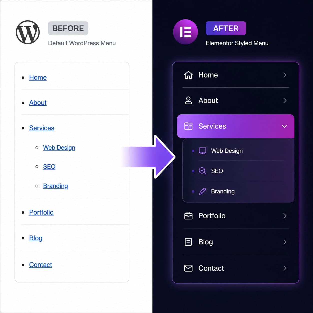
Thirty-eight percent of visitors will stop engaging with a website if the navigation layout is unattractive, according to Adobe’s web usability research. Your menu isn’t just a list of links. It’s the single element every visitor interacts with, and it shapes whether they stay or leave within seconds.
This ultimate guide to mastering Elementor WordPress menu design in 5 simple steps walks you through the complete process, from creating your first menu structure to adding mega menu dropdowns that rival enterprise-level sites. I’ve built hundreds of WordPress sites using Elementor, and the menu is always where I start because it defines the entire user experience.
Whether you’re building your first site or redesigning navigation on an existing one, these five steps will get you to a polished, responsive, professional menu. If you’re also working on broader theme changes, our complete guide to WordPress theme customization pairs well with this walkthrough.
Step 1: How Do You Set Up Your WordPress Menu Structure?
Before touching Elementor, you need a properly organized menu in WordPress itself. Elementor pulls from your WordPress menu structure, so getting this right is the foundation for everything else.

Creating your menu in WordPress
- Go to Appearance > Menus in your WordPress dashboard.
- Enter a menu name (e.g., “Primary Navigation”) and click Create Menu.
- Add items from the left panel: Pages, Posts, Custom Links, or Categories.
- Drag items to reorder them. Drag slightly to the right to create sub-items (dropdowns).
- Under Menu Settings, check the display location (usually “Primary Menu” or “Header Menu”).
- Click Save Menu.
Menu planning best practices
| Guideline | Why It Matters |
|---|---|
| Keep top-level items to 5-7 | More than 7 causes decision fatigue and hurts click-through rates |
| Use clear, action-oriented labels | “Services” beats “What We Do”; “Shop” beats “Our Products” |
| Put high-priority pages first and last | Users remember the first and last items in a row (serial position effect) |
| Limit dropdown depth to 2 levels | Three-level dropdowns are hard to navigate, especially on mobile |
| Include a CTA as the final item | A “Contact Us” or “Get Started” button gives users a clear next step |
Common mistake: Creating menu items that link to draft or unpublished pages. Always verify each link works before moving to Elementor. A broken menu link on launch day is embarrassing and easy to prevent.
If you’re building a WordPress site from scratch, our guide to custom WordPress theme development covers how menu locations are registered in theme files.
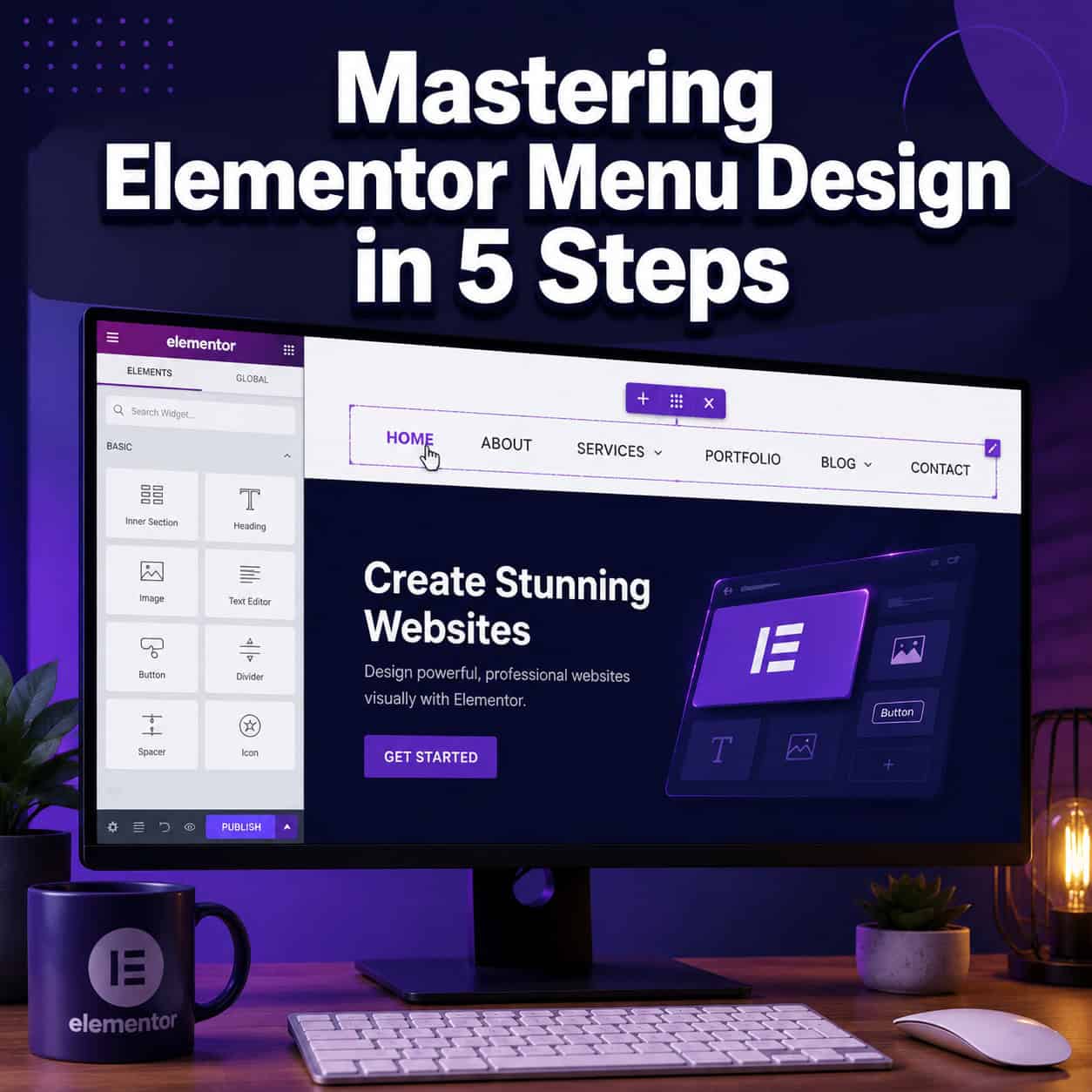
Step 2: How Do You Add the Nav Menu Widget in Elementor?
The Elementor Nav Menu widget is where your WordPress menu structure becomes a visual, interactive navigation bar. This widget is available in Elementor Pro and gives you direct control over layout, alignment, and behavior [7].

Adding the widget to your header
- Open your header template in Elementor. If you’re using Elementor Pro’s Theme Builder, go to Templates > Theme Builder > Header and create or edit your header.
- Search for “Nav Menu” in the widget panel on the left.
- Drag the Nav Menu widget into your header section.
- In the Content tab, select your WordPress menu from the dropdown (the one you created in Step 1).
- Choose your Layout: Horizontal, Vertical, or Dropdown [7].
Layout options explained
- Horizontal: The standard top navigation bar. Best for most websites with 5-7 menu items.
- Vertical: Stacks items top to bottom. Useful for sidebar navigation or single-page sites.
- Dropdown: Collapses everything behind a toggle icon. Good for minimal designs or when you want a mobile-first approach on all devices.
Aligning and positioning
Use the Align setting to place your menu left, center, right, or stretched. For most business sites, I recommend placing the logo on the left and the menu on the right within a flexbox container. This is the layout pattern users expect, and deviating from it without good reason adds friction.
Choose horizontal if your site has 7 or fewer top-level items and targets desktop-heavy audiences. Choose vertical if you’re building a dashboard-style interface or documentation site. Choose dropdown if you want a hamburger menu on all screen sizes for a minimalist look.
Pro tip: Use Elementor’s flexbox containers instead of the older section/column structure. Flexbox gives you better alignment control and lighter page weight, which directly affects how fast your menu loads.
Step 3: How Do You Style Your Elementor Menu for a Professional Look?
Styling is where your menu goes from functional to branded. Elementor’s Style tab for the Nav Menu widget gives you granular control over typography, colors, spacing, and hover effects without writing a single line of CSS [7].
Main menu styling
In the Style tab, you’ll find three sub-sections: Main Menu, Dropdown, and Toggle Button. Start with the main menu:
- Typography: Set your font family, size, weight, and letter spacing. I recommend matching your site’s heading font at 14-16px for readability. Avoid decorative fonts in navigation; they slow scanning speed.
- Text Color: Set colors for Normal, Hover, and Active states. Active state highlights the current page, which helps users orient themselves.
- Pointer: This is the hover/active indicator style. Options include None, Underline, Overline, Double Line, Framed, Background, and Text. Underline is the safest choice for most sites.
- Pointer Animation: Choose from Fade, Slide, Grow, Drop In, Drop Out, or None. Subtle animations (Fade or Slide) feel polished. Avoid flashy effects that distract from content.
Dropdown styling
Dropdown menus need their own styling because they appear as overlays:
- Set a background color that contrasts with your main header.
- Add a subtle box shadow or border to visually separate the dropdown from the page.
- Adjust padding so items aren’t cramped. At least 10-12px vertical padding per item works well.
- Set border radius if your design uses rounded corners elsewhere.
Color and spacing checklist
| Element | Recommended Setting | Why |
|---|---|---|
| Text color (normal) | Match body text or slightly lighter | Consistency with brand |
| Text color (hover) | Brand accent color | Clear feedback on interaction |
| Active indicator | Underline or background highlight | Shows current page |
| Dropdown background | Slightly darker or lighter than header | Visual separation |
| Item padding | 10-15px horizontal, 8-12px vertical | Comfortable click targets |
| Dropdown width | 220-280px | Enough room for longer labels |
Common mistake: Using the same color for hover and active states. Users can’t tell where they are on your site if the current page looks the same as a hovered link. Always differentiate these two states.
For broader design principles that apply to menu styling, check out our UI/UX design principles guide.
Step 4: How Do You Make Your Elementor Menu Responsive on Mobile?
A menu that looks great on desktop but breaks on mobile is worse than no custom menu at all. Over 60% of web traffic comes from mobile devices in 2026, so responsive menu configuration isn’t optional.

Configuring the mobile toggle
In the Nav Menu widget’s Content tab, scroll to the Mobile Dropdown section:
- Breakpoint: Set the screen width where the menu collapses into a toggle. The default is 1024px (tablet). For most sites, 1024px works, but if your menu has few items, you might lower this to 768px.
- Toggle Button: Choose between a hamburger icon (three lines), a hamburger with label text, or a custom icon.
- Toggle Align: Position the toggle left, center, or right. Right alignment is the convention users expect.
Styling the mobile menu
Switch to the Style tab > Toggle Button section:
- Set the icon color and background color for the toggle.
- Adjust the icon size (24-32px is the sweet spot for thumb-friendly tapping).
- Under the Dropdown section, style the mobile menu items with larger padding (at least 12-15px vertical) for easy tapping.
Testing responsiveness
Elementor’s responsive mode (the device icons at the bottom of the editor) lets you preview tablet and mobile views. But don’t stop there:
- Test on real devices. Emulators miss touch behavior and actual rendering differences.
- Check landscape orientation. Many designers forget that phones in landscape mode have very little vertical space.
- Verify dropdown behavior. Tap each menu item and sub-item. Make sure dropdowns open and close cleanly without overlapping content.
Edge case: If you have a sticky header, test that the mobile dropdown doesn’t get cut off by the viewport when the header is fixed. You may need to set max-height and overflow: scroll on the dropdown container using Elementor’s custom CSS field.
Choose a full-screen overlay mobile menu if your site has many menu items or nested dropdowns. Choose a simple slide-down dropdown if your menu is short and straightforward.
If you’re building for mobile-first, our mobile grid design guide covers the layout principles that apply to responsive navigation.
Step 5: How Do You Add Advanced Features Like Mega Menus and Animations?
Once your basic menu works and looks good across devices, you can add advanced features that elevate your navigation. This is where the ultimate guide to mastering Elementor WordPress menu design in 5 simple steps goes beyond basics [10].
Building a mega menu
Elementor Pro includes a Mega Menu widget that lets you design multi-column dropdowns with full Elementor editing capabilities [10]:
- In the Elementor editor, select a menu item and enable Mega Menu in its settings.
- Click Edit Mega Menu Content to open a nested Elementor canvas.
- Design the dropdown using any Elementor widgets: image boxes, icon lists, buttons, or even product grids.
- Set the mega menu width to full-width or a custom pixel value.
- Save and preview.
Mega menus work best for:
- E-commerce sites with product categories
- SaaS companies with multiple product lines
- Media sites with content sections
- University or government sites with deep page hierarchies
Don’t use mega menus if your site has fewer than 15-20 pages. They’ll feel empty and over-engineered.
Adding motion effects
In the Nav Menu widget’s Advanced tab, Elementor offers motion effects for the menu container [7]:
- Entrance animations: Fade In, Slide In from top, or Zoom In when the page loads.
- Dropdown animations: Set in the Content tab. Options include None, Fade, Slide Up, and Slide Down.
- Scrolling effects: Parallax or transparency changes as the user scrolls (useful for sticky headers that change style on scroll).
Keep animations under 300ms. Anything longer feels sluggish and delays navigation.
Performance considerations
Advanced menu features add weight to your page. Here’s how to keep things fast:
- Use flexbox containers instead of sections. They generate less DOM markup.
- Limit mega menu content. Don’t load heavy images or complex widgets inside mega menus. Use optimized SVG icons and compressed thumbnails.
- Enable Elementor’s built-in performance features: go to Elementor > Settings > Performance and enable Improved Asset Loading and CSS Print Method as Internal Embedding.
- Test with PageSpeed Insights after adding advanced menu features. If your Largest Contentful Paint increases by more than 0.5 seconds, simplify.
For more on WordPress performance and automation strategies, see our advanced WordPress strategies for power users.
How Does Elementor Compare to Other Menu Design Tools?
Elementor isn’t the only option for WordPress menu design. Here’s how it stacks up against the main alternatives:
| Feature | Elementor Pro | Gutenberg (Block Editor) | Bricks Builder | Divi |
|---|---|---|---|---|
| Price | $59-$399/year | Free (built into WordPress) | $79/year | $89/year |
| Mega menu support | Yes (built-in) | No (requires plugin) | Limited | Yes (with module) |
| Drag-and-drop styling | Full control | Basic | Good | Full control |
| Mobile menu options | Extensive | Minimal | Moderate | Extensive |
| Addon ecosystem | Largest (100+ widgets) | Growing | Small | Moderate |
| Performance overhead | Moderate | Minimal | Low | Moderate-High |
| Learning curve | Low | Very low | Medium | Low |
Choose Elementor if you want the widest range of menu customization options, the largest community for support, and don’t mind the performance trade-off. Choose Gutenberg if your menu needs are simple and page speed is your top priority. Choose Bricks if you’re comfortable with a steeper learning curve and want lighter output code.
If you’re evaluating website builders more broadly, our review of the best drag-and-drop website builders covers the full landscape.
What Are Common Elementor Menu Problems and How Do You Fix Them?
Even well-built menus break sometimes. Here are the issues I see most often and their fixes.
Menu disappears after an Elementor or WordPress update
This is one of the most reported issues in WordPress support forums [9]. To fix it:
- Go to Elementor > Tools > Regenerate CSS & Data and click Regenerate Files.
- Clear your site cache (if using a caching plugin like WP Super Cache or W3 Total Cache).
- Clear your CDN cache if applicable.
- Check that your menu is still assigned to the correct display location in Appearance > Menus.
Dropdown menus don’t appear on hover
Usually caused by a z-index conflict with other page elements. Add this custom CSS to your Nav Menu widget’s Advanced tab:
<code class="language-css">.elementor-nav-menu--dropdown {
  z-index: 9999;
}
</code>
Mobile toggle doesn’t open or close
Check for JavaScript conflicts. Deactivate other plugins one by one to identify the conflict. Also verify that your theme isn’t loading its own mobile menu script that interferes with Elementor’s.
Menu items are misaligned or overlapping
Switch to a flexbox container for your header. The older section/column layout can cause alignment issues, especially with centered menus or menus with a mix of text and button items.
Mega menu content doesn’t display
Confirm you’re using Elementor Pro (mega menus aren’t available in the free version). Also check that the mega menu content area isn’t set to display: none by a conflicting CSS rule from your theme.
What Does Elementor Menu Design Cost in 2026?
Elementor’s free version includes a basic Navigation Menu widget, but it lacks the advanced styling, mega menu, and Theme Builder features covered in this guide.
Elementor Pro pricing as of 2026:
| Plan | Price | Sites | Best For |
|---|---|---|---|
| Essential | $59/year | 1 site | Personal sites, freelancers |
| Advanced | $99/year | 3 sites | Small agencies |
| Expert | $199/year | 25 sites | Growing agencies |
| Agency | $399/year | 1,000 sites | Large agencies |
All Pro plans include the Nav Menu widget, Mega Menu widget, Theme Builder, and 100+ other widgets. The difference between plans is only the number of sites you can activate.
Is Pro worth it for menu design alone? Probably not. But if you’re using Elementor as your primary page builder (which most users are), the menu features are a strong bonus on top of everything else Pro offers.
For plugin recommendations that complement Elementor, check out our guide to WordPress plugin development best practices.
FAQ
Can I create a custom menu with Elementor’s free version? Yes, but with limited options. The free version includes a basic Nav Menu widget. For full styling control, dropdown animations, mega menus, and Theme Builder header integration, you need Elementor Pro.
Does Elementor work with any WordPress theme for menu design? Elementor works with most WordPress themes. However, for full menu control using the Theme Builder, you should use a lightweight theme like Hello Elementor (Elementor’s own theme), Astra, or GeneratePress. Heavy themes with built-in headers can conflict with Elementor’s menu widgets.
How do I add a search bar to my Elementor menu? Drag the Search Form widget next to your Nav Menu widget in the header. You can style it to match your menu and set it to expand on click for a cleaner look.
Can I have different menus on different pages? Yes. Using Elementor Pro’s Theme Builder, you can create multiple header templates with different menus and set display conditions so each header appears only on specific pages, categories, or post types.
How do I make my menu sticky so it stays visible when scrolling? Select your header section in Elementor, go to Advanced > Motion Effects, and set Sticky to Top. You can also set an offset and choose which devices the sticky behavior applies to.
What’s the difference between the Nav Menu widget and the Mega Menu widget? The Nav Menu widget displays your WordPress menu with styling options for typography, colors, and hover effects. The Mega Menu widget extends this by letting you design fully custom dropdown panels using any Elementor widget, essentially turning your dropdown into a mini page [10].
Will Elementor menus slow down my site? They add some overhead compared to a plain HTML menu or Gutenberg’s Navigation block. The impact is typically 50-150ms of additional load time. Using flexbox containers, optimized images, and Elementor’s performance settings keeps this minimal.
Can I add icons next to my menu items? Yes. In the Nav Menu widget, you can add icons to individual menu items. You can also use Elementor’s Icon List widget for more control, though this requires manual linking rather than pulling from your WordPress menu.
How do I create a transparent header menu? Set your header section’s background to transparent in Elementor. Then use the Scrolling Effects under Motion Effects to change the background to a solid color once the user scrolls past a certain point.
Does Elementor support off-canvas (slide-in) menus? Yes. Elementor Pro includes an Off-Canvas widget that you can pair with a toggle button. This creates a side panel that slides in from the left or right, containing your menu and any other content you add.
Conclusion
Building a professional WordPress menu with Elementor comes down to five clear steps: structure your menu in WordPress, place it with the Nav Menu widget, style it to match your brand, configure mobile responsiveness, and layer on advanced features like mega menus when your site needs them.
Here’s what to do next:
- Start with Step 1 today. Open your WordPress dashboard and audit your current menu structure. Remove unnecessary items and organize the hierarchy.
- Upgrade to Elementor Pro if you haven’t already. The $59/year Essential plan gives you everything covered in this guide.
- Build your header template in Theme Builder. Even a simple logo-left, menu-right layout will look more professional than most default theme headers.
- Test on mobile before publishing. Use real devices, not just Elementor’s preview mode.
- Bookmark this guide and revisit Step 5 when your site grows enough to need mega menus or advanced animations.
Your navigation menu is the one element every visitor uses. Getting it right with Elementor doesn’t require coding skills or a design degree. It requires following a clear process and paying attention to the details that matter: readable labels, consistent styling, responsive behavior, and fast loading.
For more WordPress tutorials and web design resources, explore the WordPress section on WebAiStack.
References
[2] Changelog – https://elementor.com/pro/changelog/ [4] Web Design Trends 2026 – https://elementor.com/blog/web-design-trends-2026/ [7] Watch – https://www.youtube.com/watch?v=tcpwj7Z6GZg [9] Elementor Menu Not Working After Update – https://wordpress.org/support/topic/elementor-menu-not-working-after-update/ [10] Watch – https://www.youtube.com/watch?v=J0E3OpNXq-I